Hi guys i need your opinions on this one please
3 Likes
Hello @Dazza I love the face I like it, but you should place the temperature under the hands, then the characters of the day “I think” of the week is hardly legible at least for me.
My favorite thing is your day/night indicator. I like the look and the way you’ve devised the complication. I don’t really want to comment on things I might do differently in regards to the aesthetics as that’s so subjective and also what gives each of us our individual artistic character. If you like it, then it’s perfect  But for technical details I would say some elements are a little hard to see/read. This is due to both the small size but also your font choice isn’t the clearest. Your date display for example has plenty of room in the existing window for the numbers to be much larger. Overall, I think you have some good ideas there and the making of a good adaptation from that A and S.
One of your nicest designs!
Thanks guys made a few changes wow the new editor is awesome going to make life so much easier
I like it! There are some font / alignment issues you might need to look at, but the design is really nice. I like the battery indicator placements, and the colors look really well together.
Too bad light designs don’t look so nice on my Fossil Carlyle (due to the black edge).
Ma chose préférée aussi est votre indicateur jour / nuit. Beau travail !
Very nice, love the design - well done!
speaking of the new editor, is there a changelog posted somewhere? I can’t find it. Love the zoom feature. HATE though that whatever layer I have selected at the moment is forced to the top in the working preview window. I often am aligning elements based on how I see them in relation to the layers above them. I can’t find a way to toggle that new feature off. Only workaround is to change the opacity while working on a layer. That is quite a bump in the workflow though. Seems like a feature that could be helpful sometimes but very bad idea imo to impose it as a default. Actually… have a couple of other questions about the update. Is there an official thread for this? If so I don’t see it.
I think in the bottom left theres a gear icon, click on the smart layer toggle or something its called.
hmm, I saw that but nothing changes when I deselect it. I’ll try with a different browser tomorrow. My default is Microsoft Edge.
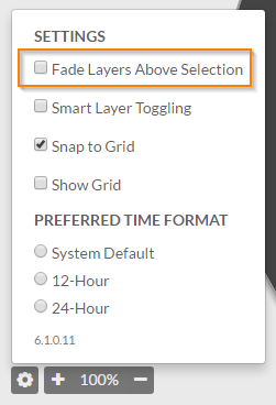
I think it is the “Fade Layers Above Selection” option. I use the desktop app. I’ve been suspecting it is just a wrapper around some default browser/renderer and the fact that I too have the latest version of the editor in the app (which has not been updated) confirms this suspicion.
Edit: That option does nothing for me, bug maybe?
fade layers hides every layer above the one selected. That toggle works. Whatever Smart Layer Toggling is appears to do nothing (in Microsoft Edge)
Strange that they roll out this update without a changelog and no description/guide for the new functions. Seems like you’d have that info ready to go prior to rolling it out.
While we’re at it… what’s the icon between opacity and the rocket ship mean? Nothing appears to happen when I click on that either.
Damn good , end of .
That’s drop shadow isn’t it? always worked for me