Hello!
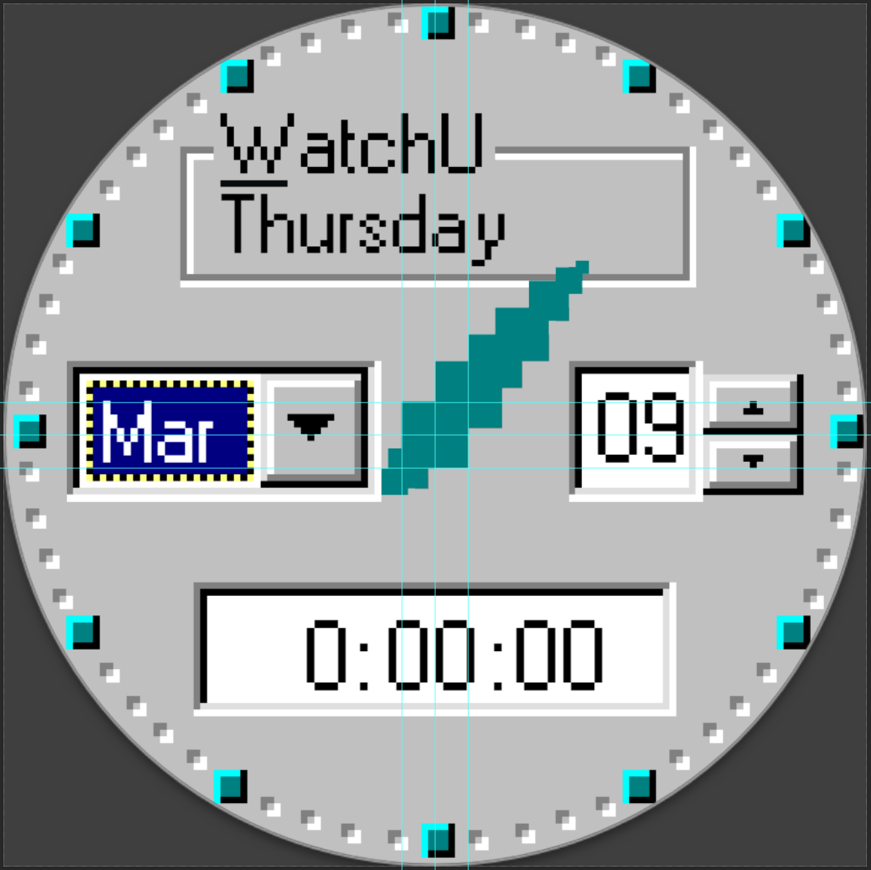
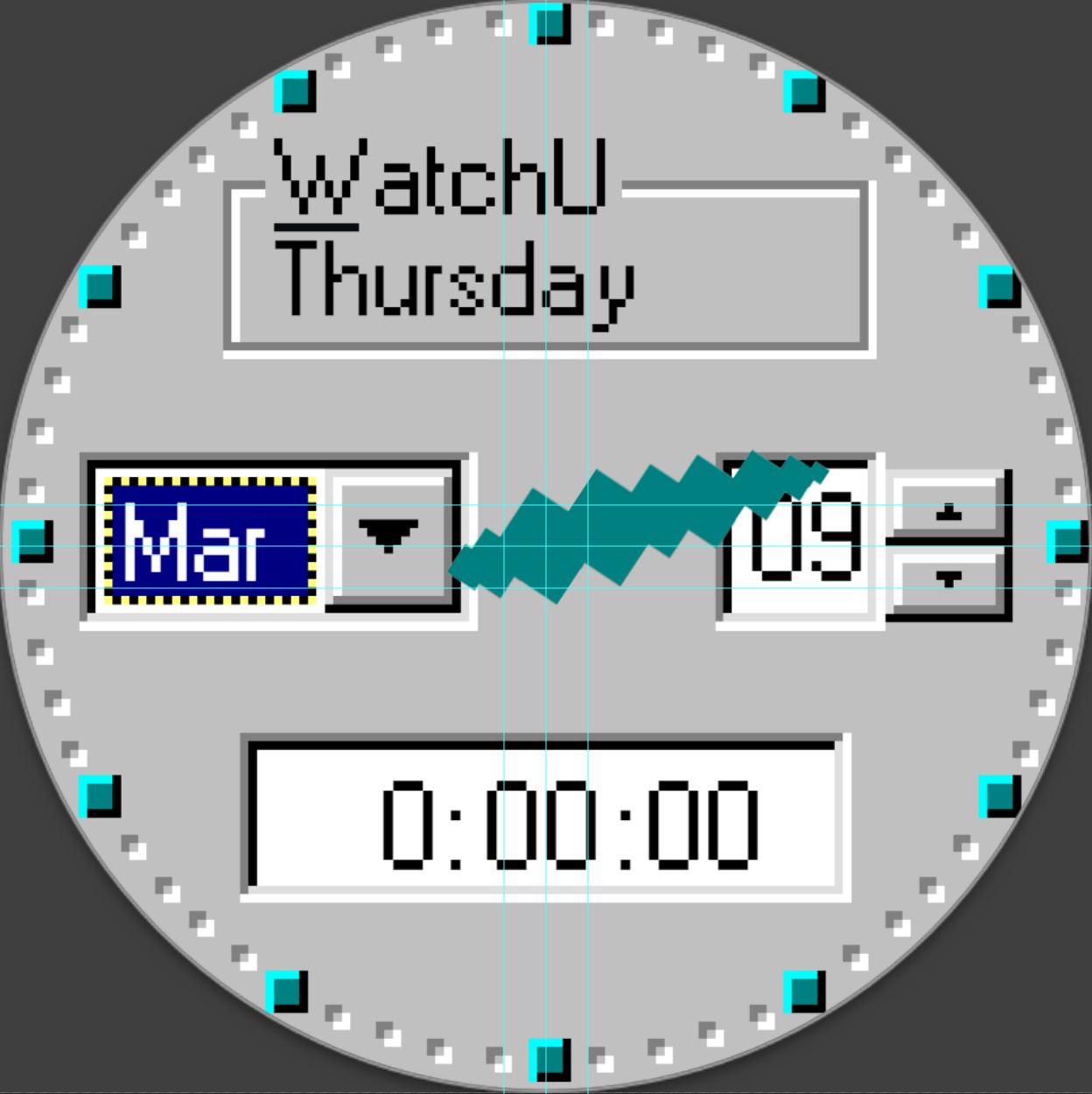
I’ve just released an “old operation system for computers” (trying not to do copyright infringement) style watchface. I wanted the hour and minute hands to behave like the original clock of the OS, which is gonna rotate pixel by pixel, in a bigger scale.
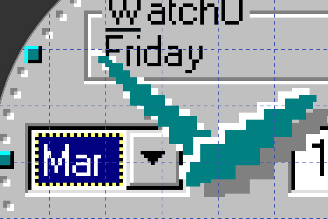
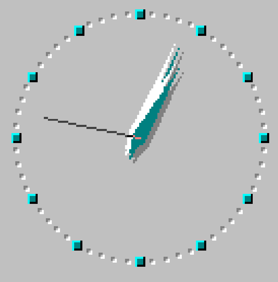
So to keep it simple, I created many squares overlapping each other from big to smaller ones, and let them move by their rotational positions by calculating their coordinates. As you can see, there is a white highlight hand and a gray shadow hand moving with the main hand, which caused too many layers to manage.
Does anyone have a better solution to create and manage, or for better (less pixelated) shapes?
And because of the way I created hands, it’s almost impossible to make a second hand, as it is just 1 pixel thick Can we make it?
That is really thinking out of the box! Does seem like a big effort to do it that way. I would probably have made a few hands looking like pixels, which would make rotation easier.
That’s a great idea and seems to work quite well. My math sucks sorry, so I can’t help, but I did think that maybe you could create the Hands as on single image
Seconds Hand wouldn’t need to be 1 Pixel wide I’m sure -
That doesn’t give the realistic look that the original low resolution OS clock has. What I mean by “pixel” is the 5x5 square boxes I used in the design which mimics the 1x1 pixels in the old OS display.
Personaly I would chose two stepped shapes for the hands and altenatete them when they move. I would not go too real as it could end up looking a bit of a mess. Perhaps dont go too literal on the Pixel scaling. Have it so you can see the pixel clear enough but it is not Blocky. You backgrond is not as scaled up ad the Hands. Of course it would be unreadable.
You could slip in the straight second hand in every 15 to add to the gag.
You can not have a 1 pixel width hand on Facer. By you scale Factor it is at lest 5 any way.
Actually both the background and the hands are in same scale. You can see how the moving pixels, background pixels and the text pixels align well here. However, I had to add more overlapping boxes to the hands for smoother contours, but each added box adds up as x3 more layers, and I’m tired of adding more of them
This is mind boggling… I always think there must be an easier way… but I’m stuck…
This world is all about increasing resolution, better compute power, and faster networks. And there are ways to emulate higher resolution, but no one ever thought of down sizing …
Hi. I feel, because the movement of the hands for minute and moreover for the hour, is almost non-visible, I would not do it/invest so many elements as you did now for those hands.
Instead I would use different images for each part of the hand for minutes and hours (the green part, white and gray). Perhaps even different images pro part, to simulate a slight movement every minute, hour.
But I would do your method for the seconds hand, because this one is the most active by nature and is the most attractive. Why not alter every existing hand element towards #DWFSS# instead of #DWFMS#/#DWFKS# and use instead images (that look the same as you present the hands now) for hour & minutes hands? Then you would emphasise your pixel idea for the hand that is the most displaying of them, seconds. I do love this idea of pixels and the zooming in aspect. It brings the face alive.
I don’t know if I understand it right.
If I make a whole hand from one single image, it will look fake when it changes its angle, as the big pixels will also rotate and leave the big pixel grid.
Using DWFSS will not make sense, as the hands don’t need to move step by step on the watch’s hardware pixels. I’m trying to simulate a 128x128 pixel (let me call them “big pixels”) area, which is the 1/5th of the Facer studio (640x640). So I’m limiting the movements, as every 5th pixel movement on the studio moves a single big pixel in the watchface. This gives me big pixels moving block by block.
And smooth seconds hand is almost impossible to manage, as the big pixels are rotating radially, I have to create around 50 separate big pixels (radius of the clock is 64 big pixels) for the hand, and 50 for it’s shadow; unless I can find a better solution instead my layers and formulas.
This is what I was thinking for the Second Hand . I need to look more at the Multi Conditional . I am sure we have done it before . Some others might join in an put better Ideas in .
If you used the following in the same manner for the hours hand movement you get 60 ticks out of it rather than smooth or hrs steps .
Obviously you realise I spent no time on tgecDrawing . It was for example only.
The only thing I can think of other wise Is multiple images. 60 images rotated when they are drawn or 15 drawn verticaly and moved with sin and cos. Less drawing more formulas.
Only 180 images max. I would personaly use a 6 degree tick for the mins and hrs.
Hi again. If you want to reduce the elements (blocks) moving as you do - and if the white ones follow exactly the path of the green - one could use graphical solutions and make green boxes with a white contouring or as a shadow and only create movements for the green ones. Unless of course you want them to move independently of each other. And you can add an extra shadow after importing the images, for the grey colour, after import. I assume you want the shadow to behave as the green boxes. And as I said before if you keep your method, the work you did to create all those elements for the hour hand, I would not do that because it is not visible. Unless you stare a minute at your watch, which will do few people. Just some thoughts to find a path to less work and still achieving want you desire. I hope this one helps.
Combining green boxes with white and gray ones doesn’t work, because the boxes are overlapping each other while rotating. If I do that, white contour and gray shadow is also displayed over the adjacent green boxes. Also, for better readability, I placed the digital texts over the shadow, so they can be visible under (over) the shadow.
You’re right, hour hand moves only each minute, leaving a little chance to the user come across a move. Minute hand, on the other hand, is formulated on the smooth value and is frequently moving. However, hour hand is just made of 10 boxes (and copying 2 times more for highlight and shadow) and creating 15 images for every quarter of the watch and multiplying it by 4 to complete the circle seems more tiring to me.
I think I need more maths and geometry