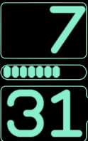
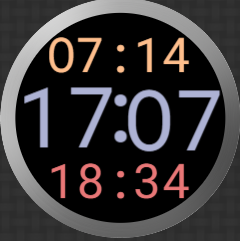
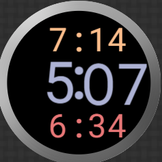
Which one, or a better choice, would folks suggest?


The last works better visually but, maybe because I would never use 12h format, 06 just seems wrong for 6pm,
So, my opinion is that everyone should just use 24h time. It’s not really difficult but that’s me, not others and it would be a sorry world if we were all the same.
The thing is, formatting the hours.
Do you pad zero even in 12h?
If not do you right justify or centre?
I have always excluded the pad and right justified and this works for ##:##

It’s also generally good for
##
##
When the hours and minutes are the same size with no border or in a rectangle.

Nothing looks quite right in a circle with bigger hour (same size leaves empty space I don’t want to use for AM/PM (come on, if you don’t know morning from evening) or seconds (it’s a hybrid with a second hand.
For me none of the three look right - i always use 06 for am. There has to be some visual separator between digital hours and minutes even if it is only a colon or the text am/pm. In my opinion the last green one looks good with or without the zero as it has a separator.
2 Likes
I prefer the top round one.
I am also for 24h format, but I have had a lot of people asking for 12h, so now I always use the Db tag, so it is up to the user to set it on their watch.
I use pad for certain digital displays where there is a background digital digit.
2 Likes
My preference is for the leading zero and 24hr time. To my OCD it just looks correct!
3 Likes
Ben al blij dat ik kan volgen , heb al heel veel gezien ( geleerd ook en word steeds leuker en beter ) Boven of de onderste . Was al verbaasd dat je de getallen ook " onder" elkaar kon zetten 
3 Likes
Yeah. I am pretty happy with how Horizontal : split or vertical split look. I am with you that fitting to a circular border vertically may never look right to a 24h heid.
I was starting to have about a 5% bias to that. Now 15%
I sooooooooo wish you could specify the pad character. ‘oooooooooo’ (add them to how much so)
I wish the world would settle for 24h time. I actually had a dream about the Facer, and other digital watchmaker communities (we outnumbered all the others put together) at an international conference to ban 12h digital time for work stress reasons for digital watch makers and savings in the programming and manufacturing industry of LCD displays.
Elke dag is hier een schooldag
Stopwatch
I actually use pad mainly for stopwatches, like this one:
The stopwatch is of the format HH:MM SS and milliseconds, coded as:
HH:MM
(pad((floor(#SWEH#%60)),2)):(pad((floor(#SWEM#%60)),2))
The seconds:
(pad((floor(#SWES#%60)),2))
and the miliseconds:
(pad((floor(#SWEMS#/10)%100),2))
GMT/UTC Clock:
Or if you want to make a UTC digital clock. There is no tag with leading 0 (except the seconds), so that would look like:
(pad(#DUH#,2)):(pad(#DUm#,2)):#DUsZ#:(pad((floor(((#Dsm#)-#Ds#)*100)),2))
1 Like
I mainly pad to preserve visual integrity (pad(#ZSC#,5))
1 Like
Leading zero: does not bother me, nor do I miss it. For the “visual integrity” I would prefer it, but to not break tradition, I mostly do omit it.
Right alignment hour field: on segmented or othervise bound digit fields I prefer it. On independent fully graphic display I would center it.
1 Like
Just those pesky circles as border.
So, I just worked round it with SR and SS as fill:


Looks lopsided in 12h mode but maybe it will encourage folks away from that nonsense.
1 Like


![]()
