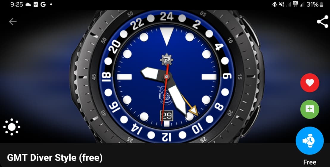
As far as I can tell there seems to be one main difference between using an arc shape over a progress element and that is the automatic background colour.
If you want it you would need a second arc, or stroke circle behind if you use an arc. If you don’t want it you have to remember to set the opacity to 0 when using a progress element.
As far as I can tell that’s it but I didn’t see the question here so thought I’d post it in case I was missing something fundamental that could make a difference in choice.
Edit: OK, one definite one is that you need to use an arc if you have 2 180° opposing arcs, such as WB on the left and PB on the right and want a background fill. The background fill would overlap on a progress element.
2 Likes
To summarize it, progressbar can be made to fill less than whole circle by restriction in formula for the filling ratio, but the background can not, it always fills the whole circle. So when ever you need the progressbar being less than full circle, you better split it into two arc shapes.
Problem is, both these elements have same bugs.
- At least in preview of the creator, when the fill ratio reaches 1 on reversed fill arc or progress bar, the fill disappears, and when it reaches 0, it suddenly fills whole circle. To prevent this there could be used clamp function that would restrict the argument from reaching the extremes like clamp(whatever tag,0.00001,0.99999), or instead using reversed fill, add rotation to the progress bar, that permanently turns the end of the fill to a fixed origin like
fill formula*(-360)
- When viewed in face page of the phone app, they do not show actual width, the outer radius is reduced
For example the top half of “bezel ring” here should have been black, but in preview its botched.
5 Likes
As always, Peter at his best, clear and to the point.
2 Likes
