Hope this is the right place for this if not plz tell me where it should go
I’ve been trying to put my own logo I created on my watch faces but no matter what file format I save it in or use for it it always imports on the creator with a black box or background any suggestions on how to stop this would be much appreciated thank you
2 Likes
Can you post the picture here on the forum so we can get a look at the file itself? I use .png files for my home made pictures in my watch faces all the time and have never had that issue. I just make sure to delete everything in the background before starting to make the image. That way the background is clear. If you use a .jpg file it will have a background even if you remove it because .jpg files don’t support clear areas. Here is an image I use a lot for a low battery alert that I made with a clear background.

You might be having issues with the graphics app you are using to generate the images in.
2 Likes
Export you Logo as .png but you must have the background transparent. This shows on a lot of graphics packages as grey and white squares. Try send some pictures with your Question. Good luck.
1 Like
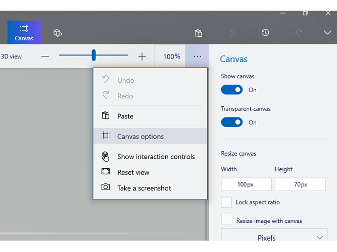
Just as the other guys said viperh1020, all you need to do is use the png format, and set your background to transparent before designing your logo. I use the free program that came with Windows, Paint 3D to do that like this -
.
Now I have mixed emotions! Should I be mad because you stole it, or should I be happy that you liked it so well you wanted to use it?!?!  Actually, if I was worried about it, I wouldn’t post it so it could be nicked.
1 Like
My mother raised me with butt whoopin’s and back hands. 
2 Likes
Thanks for the replies …I thought I was making background transparent…as I was using and exporting from the program that runs my plotters…I’ll try using a different program
2 Likes
That’s all you need to do viperh, so hopefully you’ll have it sorted now…
Show us your design here if you do sort it out please, I’m sure we’re all cur  ious to see it now lol
After looking at your Neon 2, just thought I’d mention that it’s a bit hard to see the Text information in the background, such as Steps, Date, and that, as the colour is real dark…just an observation
I should have it sorted and will post a image here when I get it done …as for neon 2 I plan to make changes to it …the thought I had didn’t work as well on this one as it had on others
1 Like
Cool, look forward to seeing it 
As for Neon 2…they’re all your designs my friend, so it’s whatever you’re happy with, I merely made an observation that’s all 
The look I was going for with it was to have the letters look ghosted kinda like some of the others I have done …it just didn’t work as well on this one
1 Like
changed it but still not sure what I think, I know I didn’t like the way it turned out before,
I’m still working on the edits for my logo but I figured out how to do the transparent back ground …just wanted to say thanks for all the help I will be posting a picture of my logo when I get the artwork finished decided to completely redo it
1 Like


 Actually, if I was worried about it, I wouldn’t post it so it could be nicked.


 ious to see it now lol

