Hello Friends .
suggest me any Change or suggestion in This Watch face design
The white numbers are really hard to read. Either need to be bigger, have more shadow behind them, or make them darker or the background darker. Nice tho!
I find that the hands do not really fit the classic look, they would be more suitable for a rugged watch face.
But that is just me…
Are the missing minute markers deliberate? I find this a strange style choice. I would suggest making the numbers darker (dark grey or black) and maybe make the 12 a bold red to match the red on the hands
Actually the red parts of the hands would look better black. Maybe the date number could be red though.
NOW UPDATED
Oh yes, that looks slick! Very nice!
Thank you sir for your time !
Now the date is emphasised I would use a different font - apart from that it looks super!
What I am wondering about is the shading of hands.
while the hour hand has only the default automatic faint shade, that can be turned on or off in creator,
the minute hand has also another darker but smoother, fixed to one side of the hand.
I would choose either one or another, but not both styles in one watch face or I would not call it realistic.

and dont forget logo ![]()
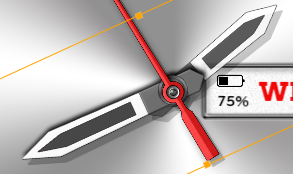
To me the Minute and Hour Hands need to be a little bigger, and the Battery Guage/Reading would be totally invisible for most of the time that the Hands are on the right ![]()
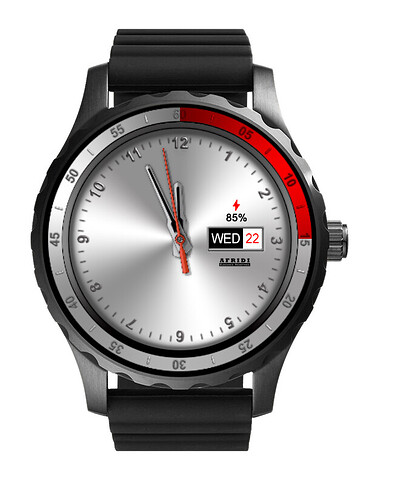
I think your battery is too small. Maybe try it above the date to sorta look like a logo almost? I messed around a bit with it to give you an idea of what it might look like. Added some red around the bezel, (maybe the 5 and 10 and markers in between could go to white) and added black inserts in the hands to make it easier to read at a glance, logo, etc.
Wow What idea !
Great work Sir you are really A Pro Designer.
I will try my best but i am a New beginner .
It is very difficult for me. Design it your way.
But i will try my Best
Thank you very much for your suggestions and time
You would do the Arc in creator with a ARC shape . set at 0.25 Fill red at 50 % opacity . Play till the size it right .
You’re welcome, happy to help! You could also try putting your logo at the top under the 12, and in place of where it is now, you could add either a small digital time, or a small set of weather icons with temp under that. Good luck, looking good!
Thanks for your To offer a valuable suggestion. Earlier I used logo. And multi-function ones have also been designed in many day watch faces.
