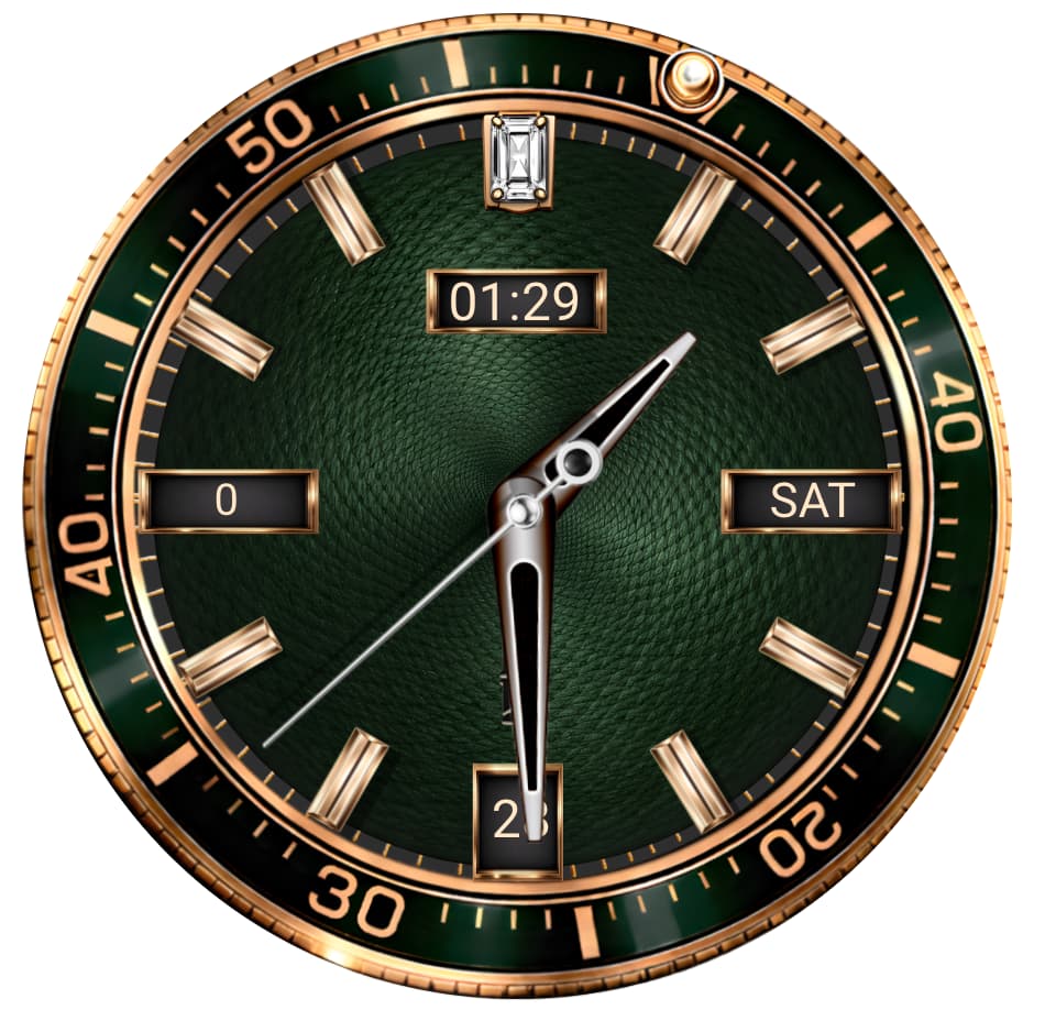
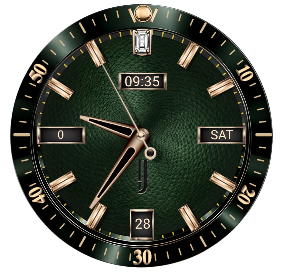
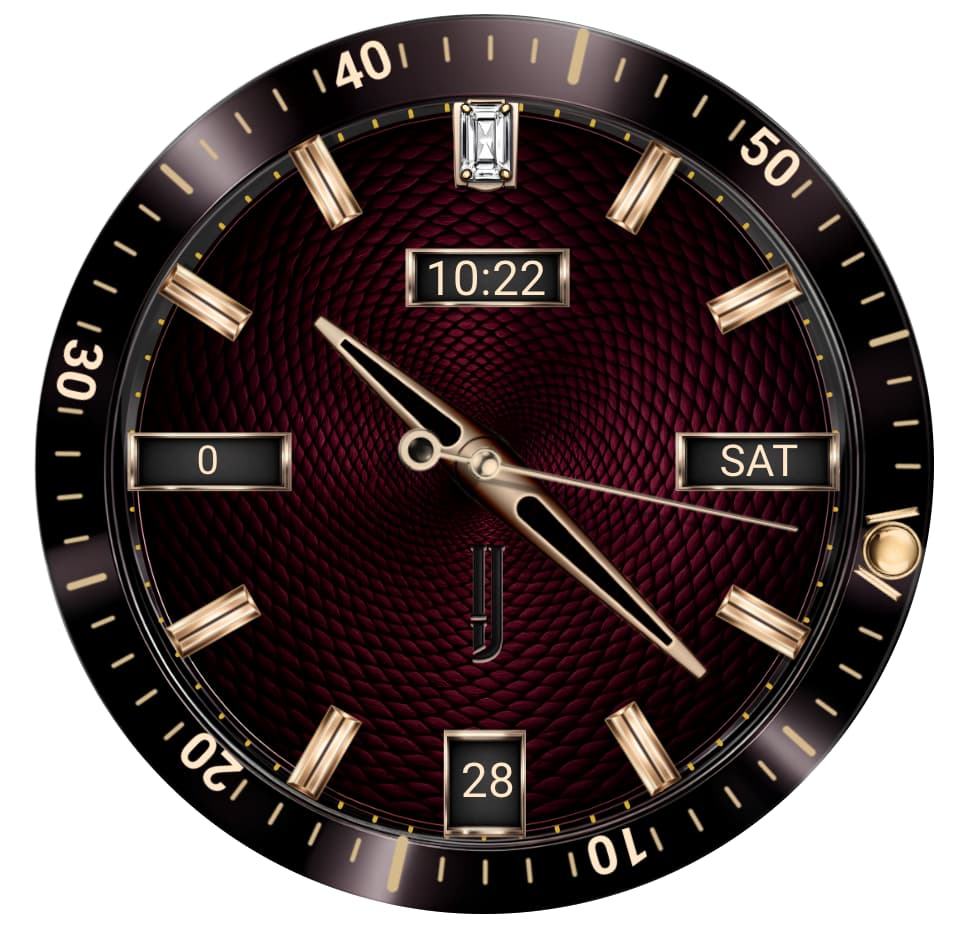
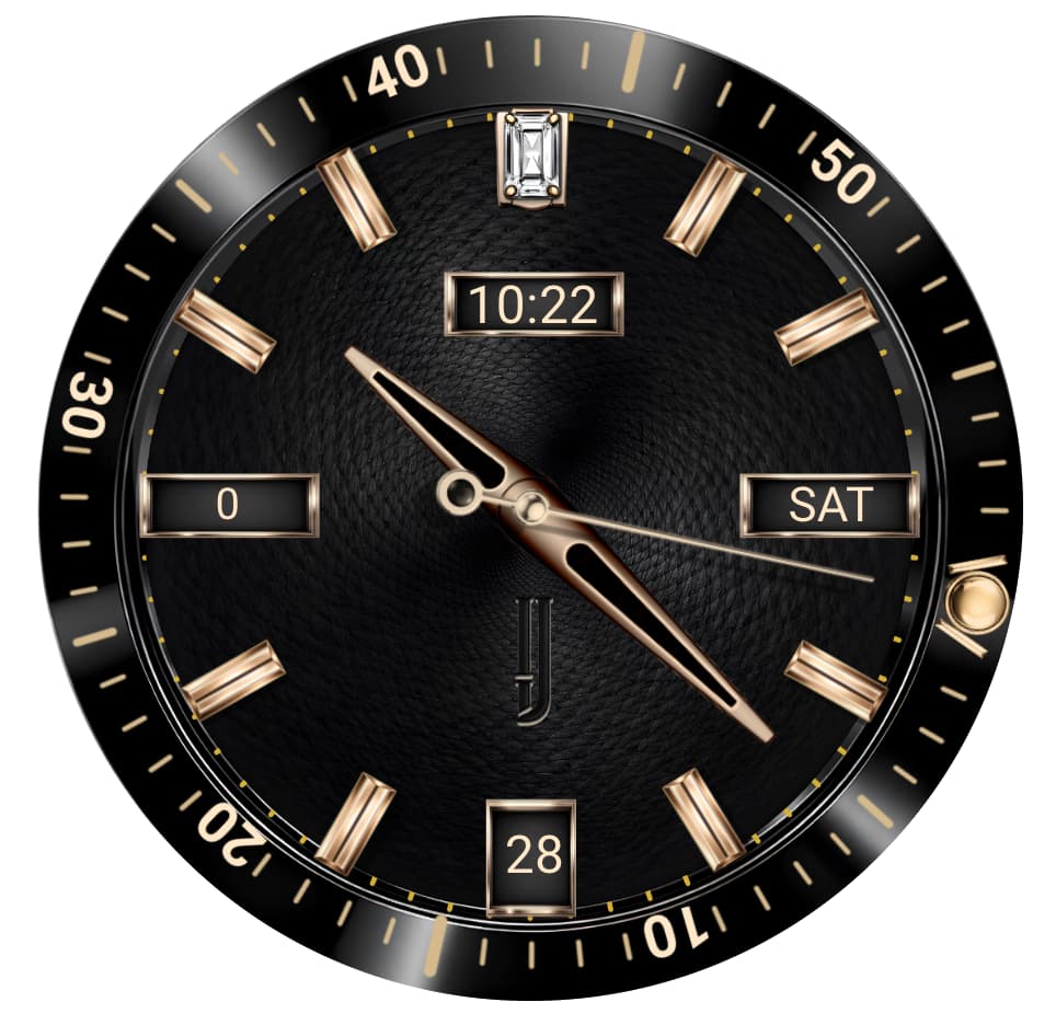
Hello,
I like the background shine and effects on both, size of added info is ok, but at first glance they look to me like cut out from some mechanical watch photo, retouched and slapped in background. Why? The out of center position of the marks in purple one and of the bezel on green one.
My suggestions:
correct the center position
stick with one common tone (be it white chrome, yellow or rose gold) for all “metallic” elements like hands and ticks in one face.
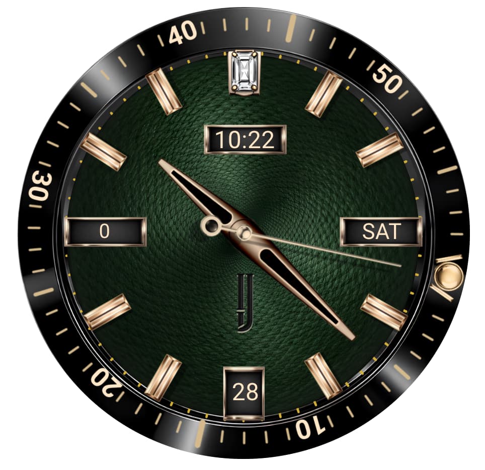
The green could use some more robust, “squarish” hands to match the thick marks.
I am not sure what the red horizontal lines on the purple one are, but if those are progress bars, they are hard to decipher and do not match well the classical look for me.
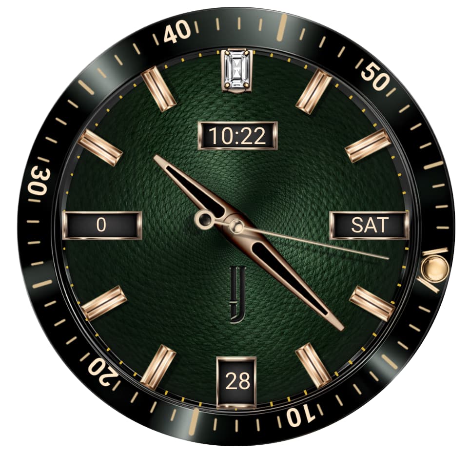
Good feedback, we already synchronized the color on our Meridian Series (the green version) for continuity purposes and aesthetics. Regarding our Altier those are progress bars built into our designed tick marks and agree a more natural color to maintain our classic horology is warranted. Thx
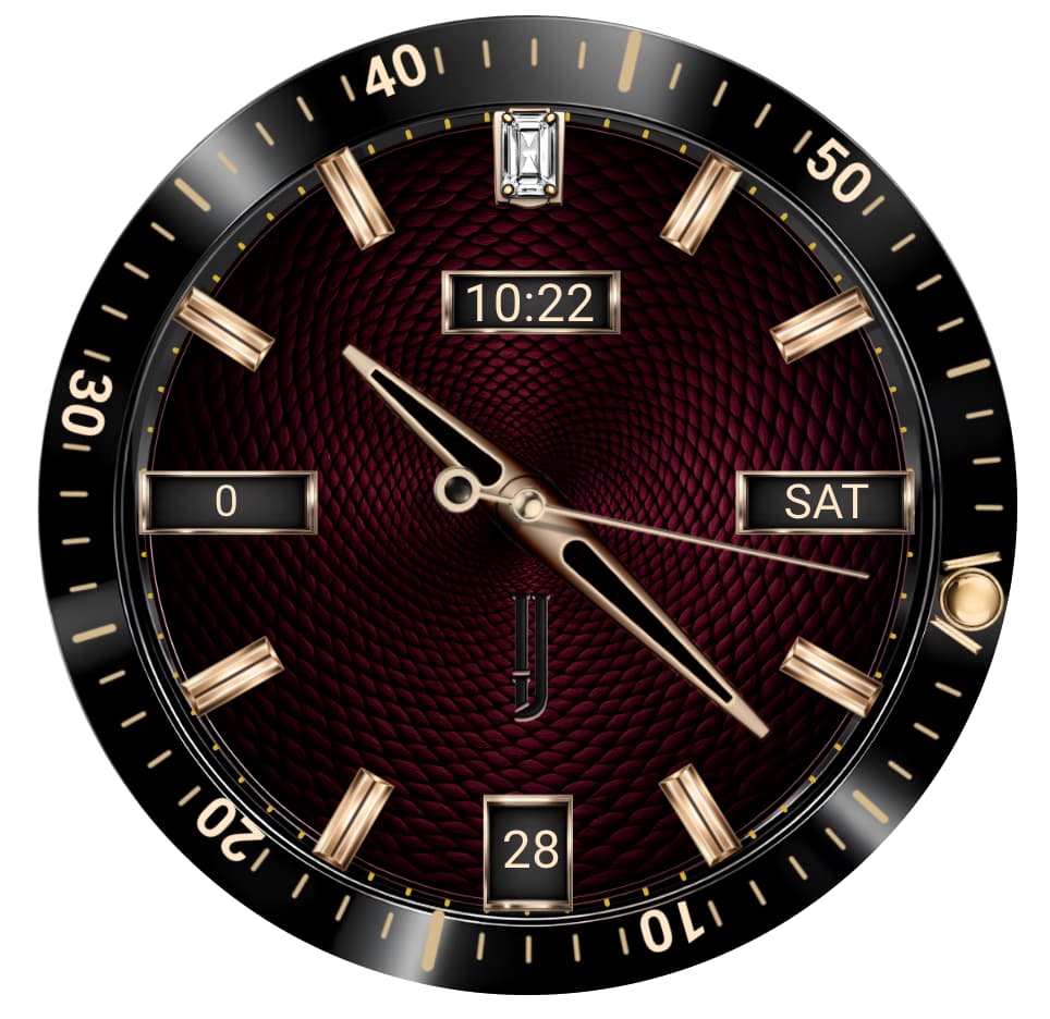
Thought you’d like to see the final production version of the ILJ Meridian. This watch has 8 complications, three single tap dial color variations, and counterclockwise rotating bezel our signature motion element. Hope you like the final