I don’t want to date me or anyone on the community but who remembers the first illuminated watch faces from the 70-80’S. i.e. the Timex Iniglo. They seemed to always have a slight bleed through or bright spot
somewhere on the face. This watch face represents that look and era. A couple bleed throughs at 12-1 o’clock and 5-6 o’clock. My attempt at the date needs work. This is what I like doing. Showing a true representation. You may think it looks like a mistake but it is intended.
I think it is ok. Only thing I would change is the text color. I would use the same darker brown as is around it.
Thanks,
I wish there was a way to duplicate the clock number font to match the date. The clock numbers are an image. I have to research “wood grain” fonts online. And work out the color after.
You could always save each individual hour number as a transparent background image, edit them so you have 1-31, and then use them for the Date setting the Opacity so the right number shows on the right day ![]()
Oh yeah, that’s a way. Just need to buckle down and do it. Thx
Looking a bit Dark to me now. I am sure you can find a Font that is near the Numeral one. Use Three text / Date layers. The middle lighter offset - 1 px x and y and the bottom one offset + 1 darker. That gives a little fake Dimension. It can look really cool.
You should be able to use the Numeral Font in Creator as a Custom Font. I copy Fonts to a folder where I keep all my hands and stuff. Facer will not use the fonts in the Windows folder.
thanks for the tips. I’ve found some ttf fonts at Google Fonts with wooded and rustic looks. Gotta get back to it.
Well Done Plenty of Fonts out there . Surprised you found .ttf that look like wood i thought they were all Black . I suppose you mean they showed a Gain . Will you please share a link .
Google TTF Font, RYE. Looks pretty good. Gonna wait to publish after Halloween. The site is flooded with Halloween themes right now.
From what I can See it looks Brilliant . I presume you have adjusted the light level to your watch . I set my watch to light level Three . Gives me a Bit of Free board . If you feel Inclined open your work for Inspection then We can Check / Copy what you have Done . ![]()
The image on the facer site definitely looks a little dark but it shows up great on my Galaxy Watch4. It is do to the image I laid over the face to show the LED bleed through.
Don’t worry about copying anything. You’ve been a great help to me. ![]()
Well done switching on Inspection . Great Work . That Font you Found is Perfect . I might get that for the steam punk I have been working on for a year . I can see you have put in a ;lot of work . I do not mean to be critical but you need some Nice Hands . Those Facer Jobbies are a bit of a let down to what you have done .You may be working on some but there are a Ton of beautiful hands on here .
For example . Some times they are difficult to hunt down .
My Bookmarks are not working properly at the moment .
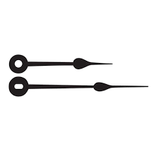
you’re right about hand choices on the creator. I changed the aspect ratio of the hands to help make them look better. I’ve checked out quite a few hands here. A lot of choices but the retro look I am going for. I would like to stay with an older style to go with the wood work. Online is really frustrating. The online hand images are usually pictured with all 3 hand in a tight image so you can’t configure individually to sit in the middle of the final image so they rotate correctly. Hope that wasn’t to confusing to understand, ![]() . I could work it out but haven’t taken the time yet.
. I could work it out but haven’t taken the time yet.
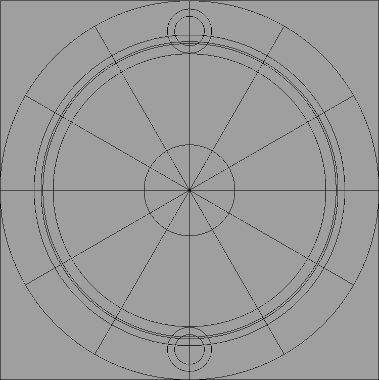
If you can post here something you like I will split them up for you . Or Explain how to do it . The secret is a grid .

I haven’t tested them yet but looking at maybe switch to this style.


I can work out the color.
Never liked PowerPoint, but I seem to underestimate its capabilities ![]() and of course your skills, Peter!
and of course your skills, Peter!
Very Nice Sir.
Nice job.

