hello Friends
check my new design watch face and give me
your expert opinion. please
5 Likes
Looks good, nice design, well done ![]()
2 Likes
The outer wheel dial and middle wheel dial are both the same rotation speed (minutes0. Is that intended? Looks like the outer dial you maybe intended to be seconds rotation?
The only other thing which is really personal taste is whether to add shadow/shading on the wheel dial cutout to add realism. But what ever you do its up to you. Looks clean the legible. Nice complimentary colours.
4 Likes
It looks nice and clean.
Like Jason, I would suggest adding some shades and highlights too, to give it more depth.
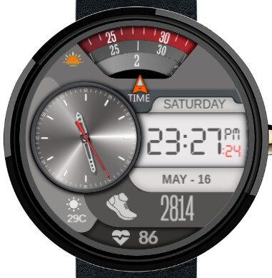
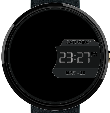
I would also consider making AoD display design more related to the active one.
2 Likes
Thanks for your Valuable Suggestions
Great idea Sir Thanks
Personally I’m not a fan if dual time watches -by that i mean analog - digital. I agree with the other comments, but I would add that the steps icon and numbers are too big, the red pointer for the rotating disks could be moved upwards to give space to the text below. The rotating discks I think show sunrise there’s a tiny ikon on its left that could be bigger. These are only aesthetics though its a nice watch