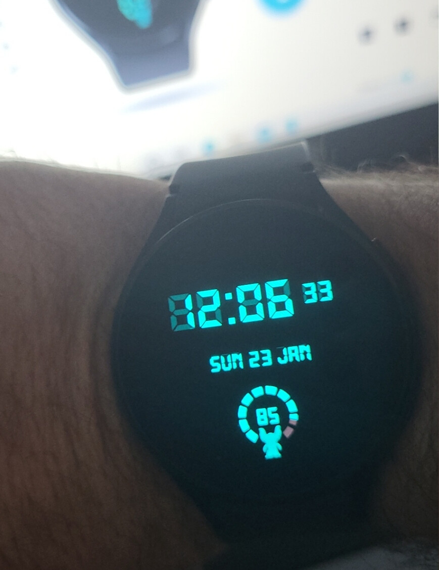
Shows me everything I need to see in a clear, crisp, and neat design 
5 Likes
You get the Best Smart Watch on the Planet and go all Simple On us .
I love it . And we get a Waterproof Gremlin to look after ::))
1 Like
Thanks mate, I really do believe it’s the best Face I’ve seen so far, and you know the old saying…less is more 
1 Like
I agree . I would love to see the old seconds chaser in the background but really quite faint like the ghost on the LCD . the second zoom half the brightness of Gizmo . intresting How we come round to the Minimal . the silly Sine wave thing I did Is quite Popular for me . Two WIP TEST faces I have Published are getting loads of syncs . Any wat this whole Watch Making thing is completely strange. I am starting to think I have a Problem . I am going to have to find some time to do something else . I am Breathing Facer at the moment.
Just sent you some doughnut hands . Let me know if you can not tint them to what you want i can make them Lighter but then you will lose the 3D . I left the dots flat as They would never show as balls in a bright Colour.
I will render them Silver if you like but it is best to colour them at that stage as they are difficult to tint after.
1 Like
Hey, that’s a cool thought, thanks for that Rusty 
Thanks for the Hands as well, I’ve downloaded and will check them out later…I popped on here quickly to make a Face and still haven’t finished looking at all the Community stuff yet 

1 Like
Yeah . It will all still be here when you get back . I have about 6 things on the go now . No rush on my part . We should go back to Kerno Time .
1 Like
who are you, and what have you done to animation gizmo?
2 Likes
New Toy, New Boy.
2 Likes

1 Like
It is, indeed, very nice. Hope the gremlin doesn’t cause mischeif.
I’ve tended to stick with my Basic LED faces as my daily driver as the red font colour seems to give me up to a 50% battery increase over white/grey/blue colours. I also like to see phone battery on the watch as well as watch battery, but that’s just me. I can also generally keep track of the day and month.
Aside from that it is a similar idea of minimalism and what you need to see.
Again, great, simple face.
2 Likes
Nice, I love the simplicity and the second iteration is even better
Awesome work
2 Likes
