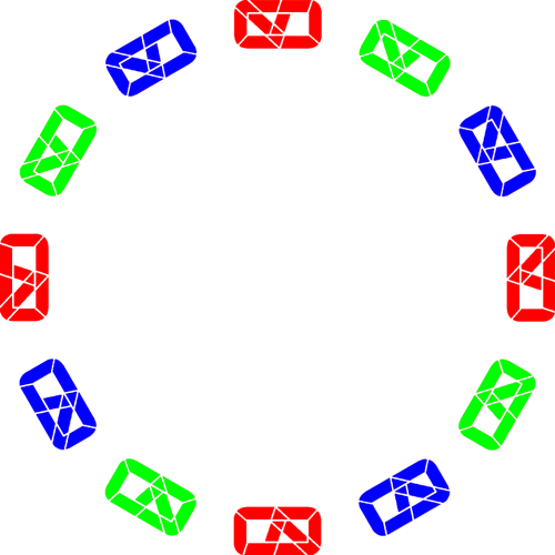
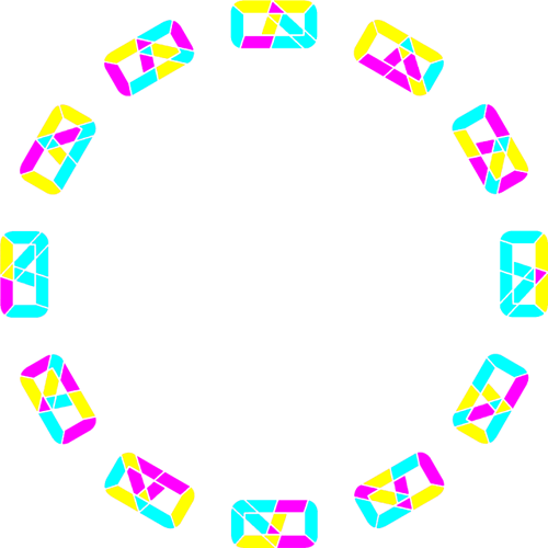
The thing is it will really work well for the seconds. Some other trick for mins and hrs. Flip Book Numerals migh be fun.
I have to Inspect the work as I am not certain what is going on.
With seconds it changes too fast. On my example each changes every 4 seconds so you have a full second of each combination. If it changed four times a second, I think it would be headache inducing. Easier with the minutes and hours with a three second transition.
In this paryiculat case I would not be upset if it showed every 5 seconds. But with the mins a change every minute might be sissapointing. I need to look at some wheels and have a play. Are they small enough to post here. 640x640.
I’ve resized them, mine are 1500x1500.
I think to do it correctly I’d need one wheel for the last digit of them minutes and the hours, 0-9. Then one for the first digit of the minutes and one for the hours, just the one and two.
But how to fit all that in to the face?
And I need to make my own font, or get AZ’s perrmission.
Just changed one wheel so it could potentially be the hours. But as I wrote, I think someone else should run with the idea. I just don’t have the eye for it.
I am very excited to have a go with those. To see how they make grey.
We have seriouy Hijacked this Topic. But I am certain @akar.zaephyr will only be Complimented.
Your test is coming allong. I love the " Out of Chaos" feel of it.
Now and again people make Ideas into Challanges. If you and @akar.zaephyr are not concerend about ownership Perhaps you could start a New Topic with an open invitation to carry on with the concept. Let us see if we have Invoked @akar.zaephyr and he is happy about the Idea.
Yes, bit unfair to AZ to hijack his thread, AND steal his font.
Started a new thread here
I do not remember anyone ever Complaining about a Hijack. But it is better if the Topic Title Describes what happens below it. What is Archived on the Community is more Searchable then. That is All.
Nah, that’s not my font ![]() In my never-ending quest to find interesting segment fonts, I’ve stumbled upon this guy’s website: Segmented display designs
In my never-ending quest to find interesting segment fonts, I’ve stumbled upon this guy’s website: Segmented display designs
He seems to be a fan of segment fonts himself, so I’ve used his work ![]() Credit where credit’s due, it’s Posy’s design, and a few more interesting designs as well which I may turn into watch faces if time allows (and it doesn’t recently!). All downloadable as SVG so Inkscape is where I turned those into source images for the watch face.
Credit where credit’s due, it’s Posy’s design, and a few more interesting designs as well which I may turn into watch faces if time allows (and it doesn’t recently!). All downloadable as SVG so Inkscape is where I turned those into source images for the watch face.
Feel free to use it, author himself allows usage of his work for non-commercial purposes (and for commercial as well, just takes talking to him ![]() ). I’ve credited his design in my watch face page, though it seems not well enough since nobody noticed that so far
). I’ve credited his design in my watch face page, though it seems not well enough since nobody noticed that so far ![]()
Hijack my thread all you want, I’ve got nothing against it, but @russellcresser is right that for tracking purposes, it may be easier to find for future users if it has properly-named thread of its own. Up to you really, feel like at home here, I won’t ever show you the door out ![]()
PS: I actually have, only few, segment font designs of my own, but… Let’s just say I’ve just started experimenting with it and it’s nothing I could publish without embarrassment. I’m still learning this sort of graphical work and my methods for the moment are… primitive. It’ll be some time before I can actually present something of substance. But who knows, maybe one day ![]()
Thank you and thanks for the link, I’ll definitely check that out.
I initially posted the idea because I thought you might find a good use for it. Seems to fit in nicely with what you are working with.
I really love the idea! Both, actually, the color combination that only reveals its digits while both wheels are aligned, and the rotating discs to achieve it.
I’m thinking of trying to animate this while using opacity animated with passing time, #DWE# maybe, so that time can be saved replacing rotation with simply going invisible and back to visible.
Need some time to test it out ![]()
Yeah Time is All we Need.
@akar.zaephyr Happy you like it! If you need any help with rotation, conditionals etc, you know where to find me.
Is this another profile or is the similarity coincidental?
Neither, I was inspired by Anzio and wanted to make my own color schemes for it ![]()
I actually wrote that in the watch face description, though it’s not the first time it seems nobody’s reading it haha ![]()
I should get better at reading the descriptions.
Btw, I made the digits as a font. If you’re interested let me know. Made a few of posy’s others as fonts as well, good practice for understanding how it all works.
By all means, please do ![]()

