Hi guys.
I was working on a watchface, mainly to learn a little about conditionals and moving things around.
I wanted different backgrounds for square and round (yes I know there is an option) and I wanted to change them with the following condition:
Round background active:
$#ZISROUND#==true?100:0$
Square background active:
$#ZISROUND#==true?0:100$
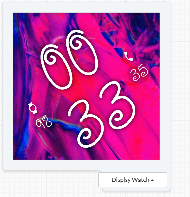
I think my code is ok, and the preview in the creator shows it fine:

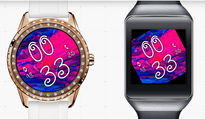
However when I want to publish the preview shows the following:

I don´t expected any square users to download it if it looks like that
Is just the preview wrong? or is something else wrong?
1 Like
Nice design!
The published background image looks different to the one in your preview - colour patterns are different (?).
The image in the square watch also looks like it has been rotated and it is then too small. You could try increasing the scaling ( image size ) to see if that solves the problem.
Hi @mikeoday
The first image and the second are the same.
For some reason when I publish, in the preview (image 2) it is showing the wrong background.
The background is rotating, and I have 2 images, one for square watch and one for round watch.
In the opacity I have the following logic
Round background image:
$#ZISROUND#==true?100:0$
Square background image:
$#ZISROUND#==true?0:100$
The only difference really is the scale, the round watch is 330330 and the square is 450450 (so that when it rotates it covers the corners)
I will probably just resize the image in photoshop and upload the different backgrounds forneach watch, but im unhappy that my original design is showing correctly in the creator, but not in the watch preview
1 Like
Basically I only made the watch to test some codes and mess around.
I like the dim mode even more, hopefully you can see it soon
1 Like
Sorry, I can’t really tell what is going on. I you wanted to enable inspection mode I would be happy to have a look.

