Hi friends,
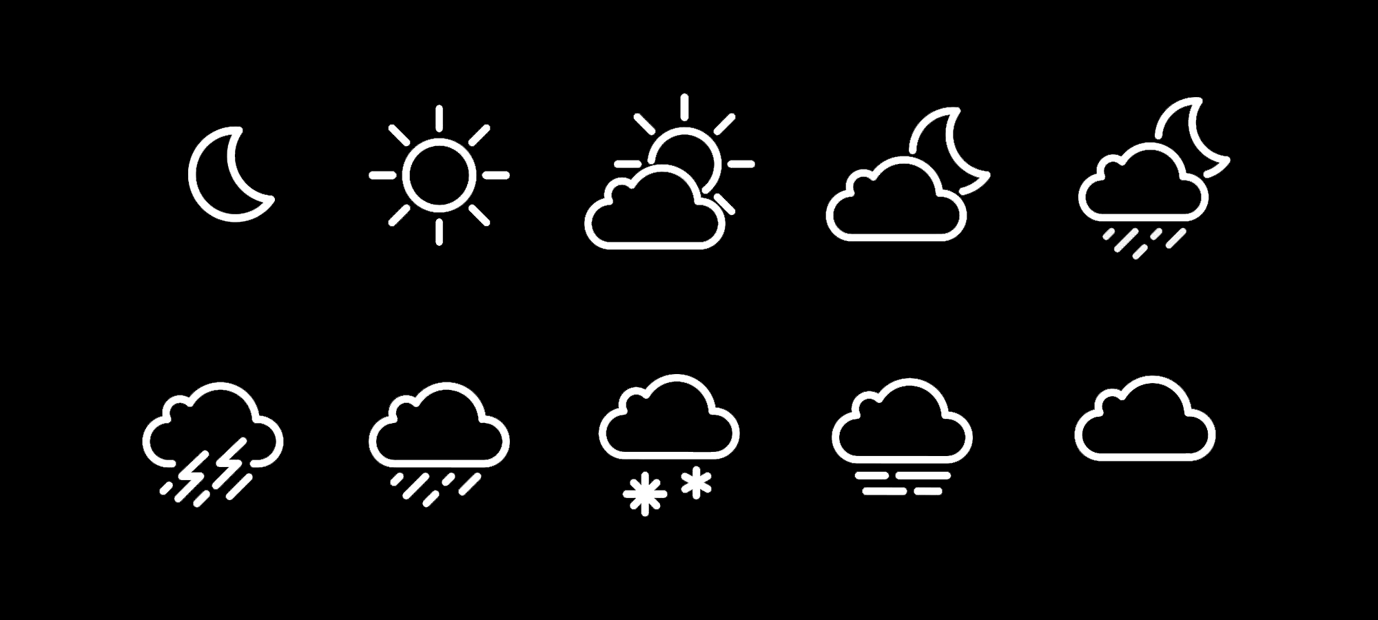
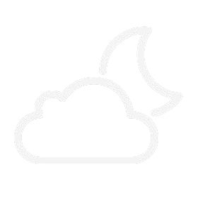
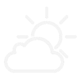
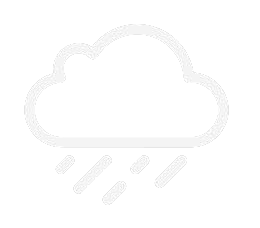
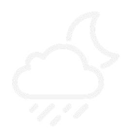
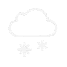
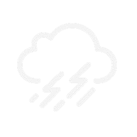
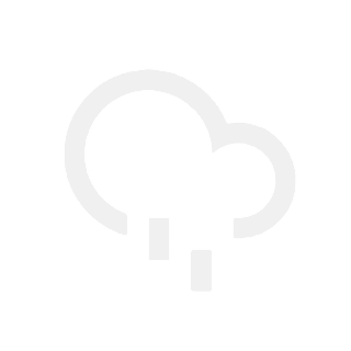
I’ve made some weather icons that I think are a bit less bulky than the default ones. They’re white on a transparent background for easy tinting (though when I upload it changes it to grey on a white background, despite uploading as a .png…right click > ‘save as’ and it will save correctly for you though. Let me know if there is a better way to upload. I’ve uploaded a summary graphic to show what they all look like on a black background too). Feel free to let me know if there are other icons I should make
Few Clouds and Shower Rain . Please . I make shower rain less than rain . There is some confusion there but I think that is right . As Peter said Including the Night Icons will really round that set of . Jolly well done .
Added more What would be the best way to differentiate shower rain from rain, just fewer rain lines? Also, I note that night icons aren’t available in creator by default - Is the best way to implement them just having 2 sets of icons and altering the X position with #DISDAYTIME#?
Yes and Yes . You have a good handle on things . If you want to do forecast Icons you have to make the 9 layers for each day . 18 if you want day and night . So you will see that those who do it properly have done a lot of work . You may get reports that DISDAYTIME does not work in that case there is a GRUNT formula composed by the giants . I have a copy somewhere . I think it might be older Tizens .
I dont like the term shower rain. For me as non native English speaker it means something like more intense rain, while I learned it means sporadic rain, occasional or local.
The sad thing is when it comes up in Text on a face it is something like Intermitant Light Rain . So when you think you have made space for the Description it is too big . Facer should name the different weather description Text as the Icon labels . Just saying . I think they leave it like that so we have something to talk about in the Community .