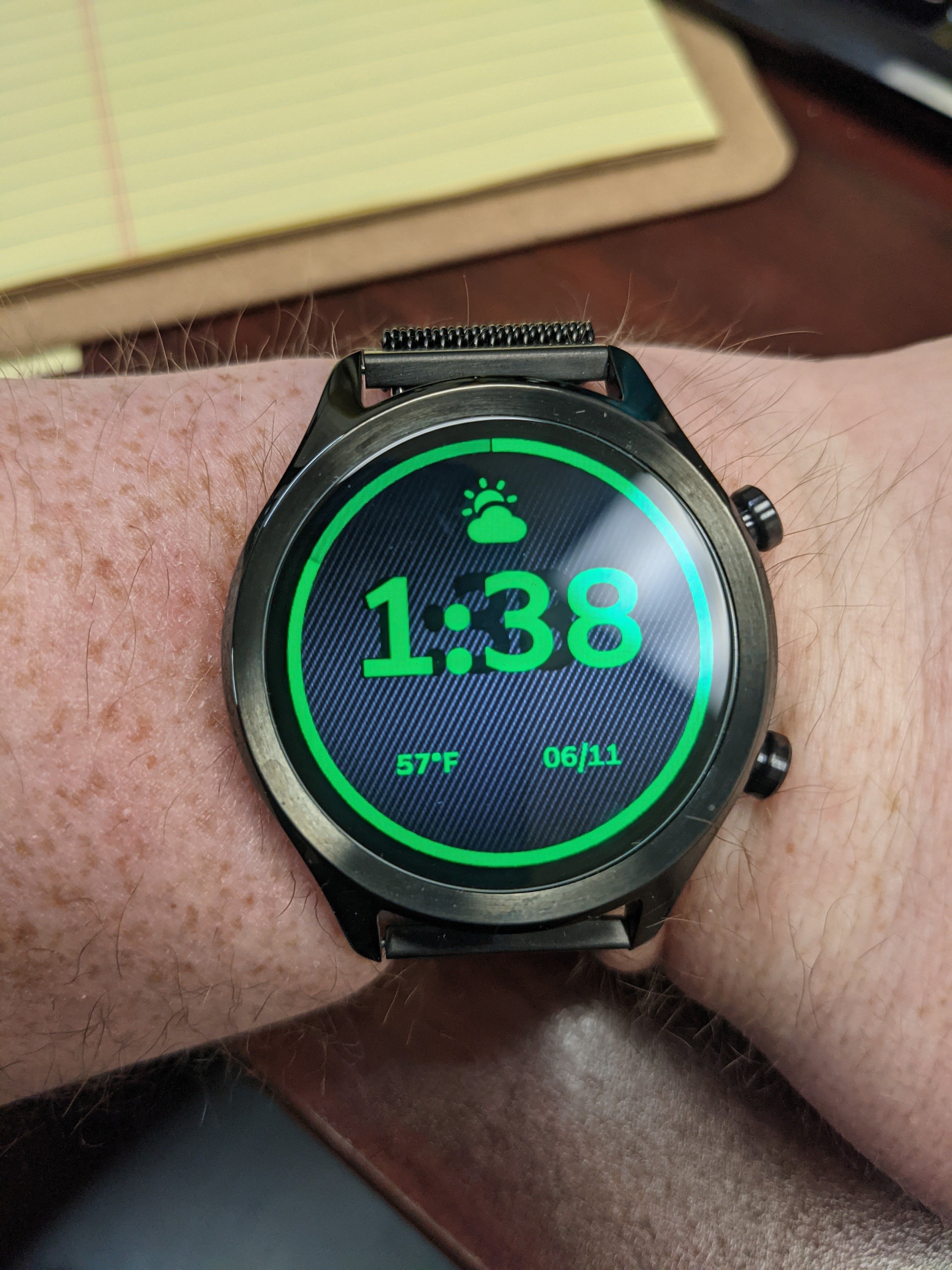
I’ve encountered an issue with strokes on changing layers such as dates, battery, etc. It is most pronounced on the time however. The stroke seems to change size independently of the font over time. When I first sync the watch face to the watch everything looks fine but after a while I end up with the stroke way out of place. It’s doing on multiple watch faces and I suspect it would do the same with shadows although I don’t know this to be true as I haven’t tested it.
I found a few older posts from a couple years back that sound like a somewhat similar issue related to the chip set in the TicWatch E/S, but the only response was that it was a bug and the Facer team was aware and working on it.
I am using a TicWatch C2.
That is a current issue with all WearOS watches. They do not render the “glow” or “stroke” effect after a while and it seems more pronounced the larger the text is. When you first sync the face it will work but then does exactly what you are showing in your picture. Putting a second version of the text in black with a reduced opacity works fine on WearOS. I personally don’t use glow or stroke anymore in my faces just because of this.
2 Likes
Ahh okay thank you! I’ll try a second version of the text behind in black!
1 Like
Good luck, and please let everyone here know how it works out…
It does not really work, the text layers do not scale evenly from all directions so making it line up perfectly is impossible. Does anyone know how long this bug has been an issue? I’ve been absent from the Facer platform for a while and only recently came back when I finally got another compatible watch. This bug has effectively ruined all my watch faces as I use strokes to add a bit of needed contrast and if it is affecting everyone on every WearOS watch it seems Facer would want to address it ASAP.
I’ve been on Facer now since June of 2019 and it’s been an issue since before I joined. Below is a face of mine where I use the extra text behind below and right as a shadow and also a third layer above and left like the sun was shining on it… Below that one is a face I use a font with an outline version and a solid version for that “bit of needed contrast” you spoke about.
MAG 1396
MAG 966
Inspection is open on both watch faces so you can see exactly what I have done to “work around” the WearOS stroke issue.
3 Likes
That’s really discouraging that it’s been broken for two years now… but you’ve done an excellent job with your work around. Thank you for sharing I’ll try to figure out how to make it look as good as you have.
1 Like