hello friends .
suggest me any change . in this watch face
3 Likes
Looks good to me my friend ![]()
4 Likes
Looks good to me.
But for me the Sunrise hour is of little value, would want the minutes as well.
And I would change “STEP” to “STEPS”.
2 Likes
nice idea.
I would turn the hour numbers 4-8 with 180 degrees and I would make the digital text a bit darker.
Thank You sir for good suggestions.
updated.
2 Likes
Hi. Nice color scheme and data display. For me it needs more contrast, more dynamics. You could try more black instead of gray for contrast and readability.
Movement, dynamics is more complicated but I have in mind moving the outer bevel from out of display inwards. Because of that, you create place where the bevel now is and I would show there a great spinning dial or cog for a while. The outer bevel shrinks then timely back to its place.
Same with these handles, they are lovely. I would separate them as 4 objects and make the same movement from outside, inside.
I show you later a face of mine, based on these concepts.
Best greetings
BC
1 Like
One thing I do not like is, as @russellcresser puts it: “dancing digits”.
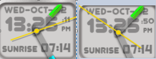
In the picture you can see that the seconds 11 is a lot more narrow than the 50, and the position varies. I prefer to use fixed width fonts so that you do not have this effect. With non-fixed width fonts, what you can do is spilt the time into 6 digits and align them to the right.
Code for each digit:
Hour 1st digit: (floor((#Db#/10)))
Hour last digit: (#Db#%10)
Minute 1st digit: (floor((#Dm#/10)))
Minute last digit: (#Dm#%10)
Seconds 1st digit: (floor((#Ds#/10)))
Seconds last digit: (#Ds#%10)
And with that you can have the delimiter (the colon) as separate element and make it blink.
Call it perfection or over doing it, but that is what I do…
5 Likes
cool hint
1 Like