I’m wanting to stick to my same themes for a Rugged Collection. I’ve been taking everyone’s feed back and trying to bring the faces together that would make more sense, so this face is relatively simple in terms of what’s on it. Sometimes simplicity is better. Hope yall like it!
3 Likes
You’re welcome thanks @tylernewellucc 
Comments for this Face:
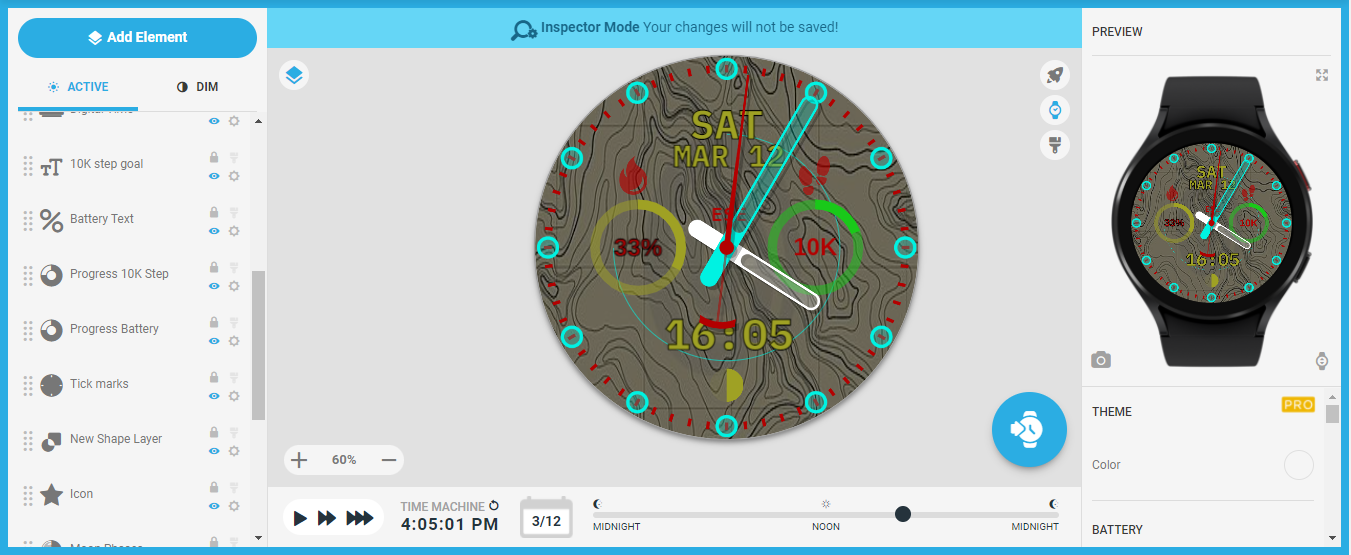
You’ve got your Steps and Battery Power Icons the wrong way round, they should both swap positions, and they’d look better if they were both at the top of the relevant Progress Rings, with the Steps one enlarged as well, it’s still hard to see it.
The Tickmarks are very visible in that colour, maybe because they’re quit thin, maybe change them for some thicker/bolder ones and also change their colour.
Lastly, the Battery Text isn’t very clear, as well as the Month/date being not too clear. Maybe change Battery Text to same Font and colour as the Steps Text, and just enlarge the Date Texts.
That’s my Feedback, and below is a set of wider/bolder Tickmarks you’re welcome to use if you want, White in colour so they can easily have whatever colour you like applied in the Creator.
![]()

1 Like
Take a look at this pic below. All I did was change the Tickmarks, then move a few bits around, change some colours, and then enlarge your Date Texts.
4 Likes
Wow! That looks awesome. I see, thanks again for helping me with the fundamentals. Imma get this down lol
2 Likes
Ha ha, no worries, don’t forget about Opacity levels as well, which set how visible/transparent things can be.
1 Like