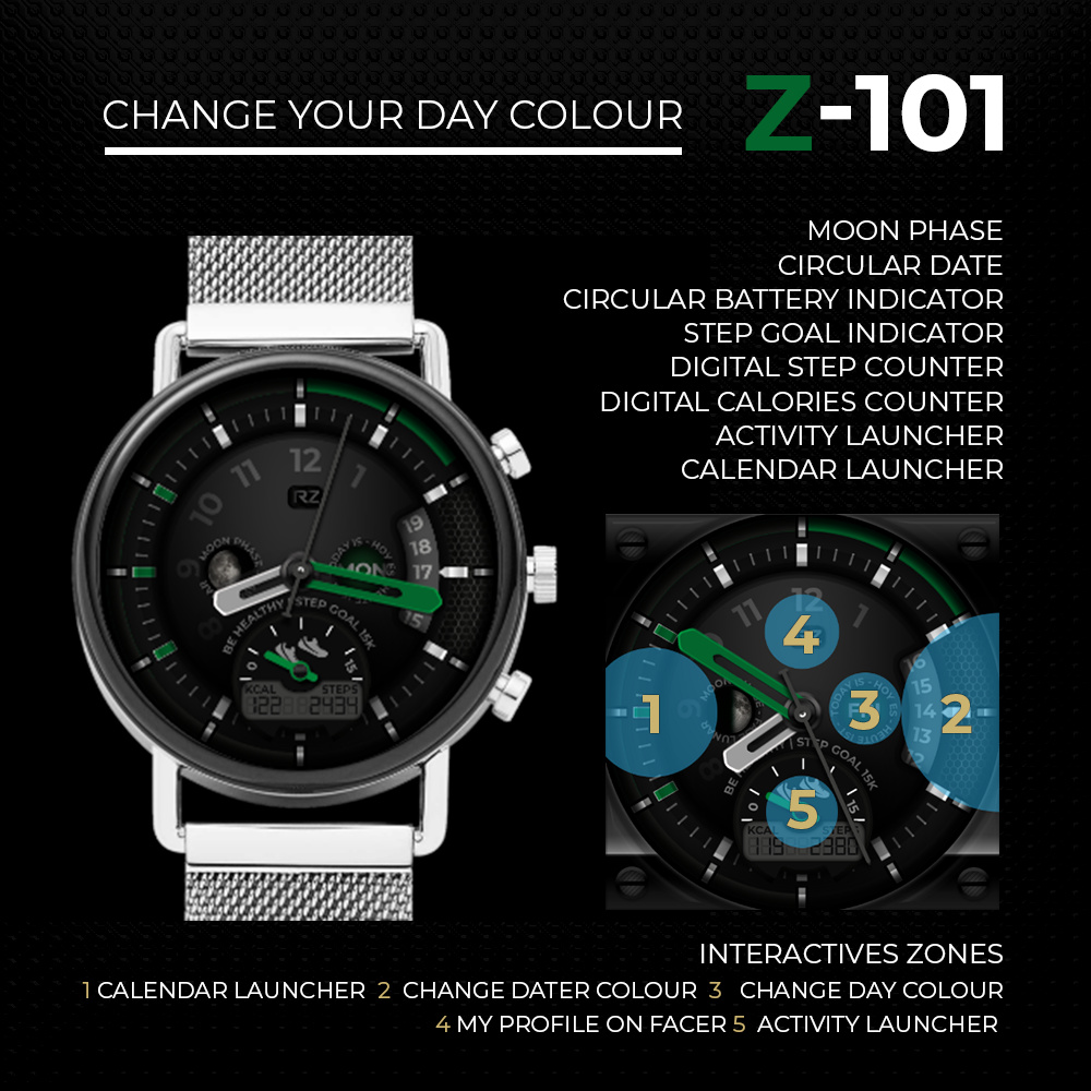
Hi guys, I wanted to brag about my new watch face  I’d like to get feedback
5 Likes
Things I like more:
Very nice and accurate and personal graphic.
Very original disposition of elements.
Very stilish.
Things I like less:
Green in DIM mode… maybe it is not very “battery saving”
Low contrast in the central circle… grey numbers, date weel…
Low light in the LCD panel
Allow me to tell you this because I admire your work and I hope I can make a small contribution to make it better and better!
2 Likes
Thank you @dario.marnoni your feedback is highly useful. The problem with low contrast is that when I use gradients the light in the background which comes from the watch illumination usually change my colours. I’m trying to equalize things yet. And about DIM mode you are right, I used to make dim faces for Dim mode, but in this case, I wanted to be different, in spite of the fact that it could be batteries drainer. Too many things to learn yet!
I have got your problem too
Low contrast and ‘gray’ dominant
It is not easy to get a good chromatic balance… I think at some faces from GRR for example or GAUSS…
1 Like
Thanks for the flowers, @dario.marnoni. You‘re right - chromatic balancing and harmony isn‘t easy to achieve, as well a good contrast ratio… especiall at dark watchfaces. @riczurdo: i am with @dario.marnoni s pros and cons. You mostly need a higher contrast of the elements.
2 Likes
Thank you guys. I need a tutorial  chromatic balancing, harmony and contrast ratio.
Hmmmm… i wonder if there will be one on youtube…