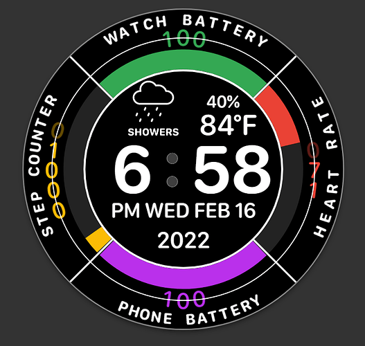
I knew it was going to take a while with all the curved text, especially the vertical text. Now that I have it finished I’m even impressed with it.  MAG 1706
Looks great Rusty, nicely done Sir 
(No Inspection?  )
)
Did you put those words in there one letter at a time to make the curve?
No, I cheated by using the circle text function in Paint (dot) net. Those are graphics. I’ll post them below in case anyone ever wants to make use of them.
Description is below the white graphic.
Heart Rate
Phone Battery
Watch Battery
Step Count
Very cool ,looks very polite,heavy work to make counters once per once to curve them 
I thought that inspection was on. I had it set to on and every face I was making was automatically on. I guess Facer changed something again. Inspection is turned on now. (I think)
Great Work . Respect for Sharing your work Inspectable .
Just a little heads up rather than doing subtraction .
Thanks @mrantisocialguy , just figured out how to install that pluggin into paint.net. It will surely come in handy pretty soon. 
Very nice and clean layout!
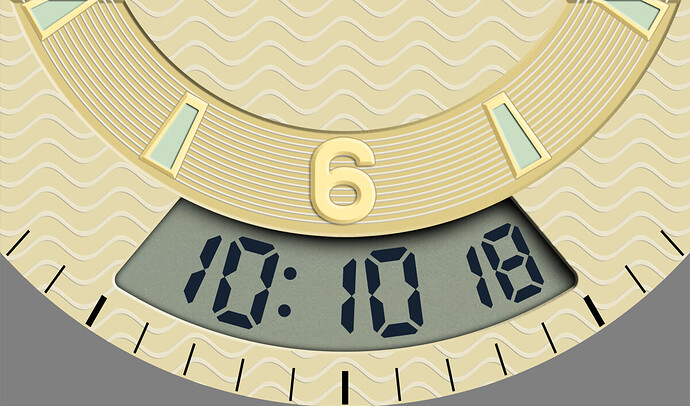
And yep, curved text is a pain. I just ran into my first curved text headache working on my first vintage digital analog hybrid, made more complicated since it’s the LCD digits that are curved.
I ended up placing a single “8” of the appropriate size using a custom LCD font (built-in ones are slanted, which doesn’t work), centered in the dial’s window, inside Creator itself. I took a screenshot of that and brought it back to Photoshop, and made a swiveling “slice” out of it centered on the dial’s spindle. From that I made 4 copies, so I could place each digit properly spaced and properly angled. I repeated that for the colon and the 2 smaller sized seconds digits. Once I had all 7 slices placed properly and had each one’s angle recorded, I brought a screenshot of that into Creator and placed 7 separate text elements using the second screenshot as a guide, along with the appropriate angles per each digit. It took quite some time, I must have had the obsessive-compulsive option turned on in Photoshop 

Once I figured out how to handle each digit, I ran into my next issue (this is my first hybrid): using a second hand with a formula (either the modula version of the version I found in another post) to give it more than 1 tick per second makes it lead between 0.5 and 1 second ahead of the digital seconds. 
If you strart with the digital face you get a bonus, non slanted LCD font that matces with an
88:88 shadow and the old, basic heart icon
@kourosh With the the split second formula you have options. round, floor, and ciel . Let us see the code and it can be synced to the Digital. Is it. 5 sec you want? I can look at that tomorrow . On the Tablet at the moment.
Nice work with the curved LCD. : )
Or you can ask Rob Fisk to send you some special moddled ones.
I do have a test face somewhere that you ca use the time machine and it gives you the angle of text needed when doing it that way. just need the glue to dry a bit more on this woofer, phone base
I was just using the little tab at the top of the box to twist the digits close to where they looked good. Then I would just play with the last number changing it up or down to finish it. I used a ring shape where I wanted the digits to fall and used zeros to line the top and bottom of the zero to the curved line. Then deleted the ring when I got it all lined up. That’s why there are large numbers in the rotation instead of using a negative number. In other words, I used the K.I.S.S. theory. (Keep It Simple Stupid) 
What I was using (so far) with the above hybrid face is either of the following:
- (#DWFSS# - #DWFSS#%3)
- (round(#DWFSS#2/6) / 26)
The first one I came up with experimenting with modulo in Excel, and the second one (no pun intended) I got from an older post on the subject of multiple ticks per second.
I’ve been messing around with this subject using this:
Thanks for that tip. I had always started with a blank slate, didn’t realize the digital template has another font embedded in it… if I only knew, I must have spent hours looking for a nice looking non-slanted fixed-width LCD font-- but I did finally find one here:
https://www.dafont.com/lcd-at-t-phone-time-date.font?text=121134567890
Looking really good @kourosh I’d love to see the Face in it’s entirety, and there’s plenty of non slanted fonts on the usual free font sites, such as THIS ONE for example.
Oh, and I love the Roll-eks logo, had me  there
there 
Thanks for the Font .
I was saying try for (round(#DWFSS#*2/6) / 2*6)
(floor(#DWFSS#*2/6) / 2*6)
and if that is not the answer
try
(ceil(#DWFSS#*2/6) / 2*6)
