Could I please have your thoughts and suggestions on this Face guys?
I love the sweeping tickmarks and battery percentage readings, so try to include them when I can.
If I was going to do the sweeping tickmarks, or any tickmarks for that matter, I would make sure they don’t interfere with the numbers. There are a number of ways you can address this - either bring the numbers in closer to the centre, or block out the tickmarks behind the numbers. I like the tickmarks themselves. Nice detail. The battery indicators are a little ambiguous. Not sure how they look on a watch face, but on my screen they don’t really look very different from each other. If you use a phone for the phone battery icon, wouldn’t you want to use a watch for the watch battery icon?
My only other comment would be that there’s a lot of flashing going on. In design, less is very often more. It is of course open to interpretation and personal taste, but if I was going to use the central animation, I wouldn’t also animate the weather icon and the second count. It feels as though there is too much competing for attention.
Don’t mind my writing style. It tends towards negative because that to me is what a critique is. I don’t have any specific comments on the overall idea, because it doesn’t really fit the style I would wear, but that doesn’t mean it wouldn’t appeal to others (you have more followers than I do  ) . Take it all with a pinch of salt and decide for yourself. That’s what sets us all apart and why we’re able to all come up with something different.
1 Like
Too me it’s too busy, but please understand I am mildly A.D.D. and get distracted very easily. I have faces that are busy like that also, but I will never use them as my daily face just because of that. As far as quality it looks like a very nicely done watch face.
This is one of my faces that I made and can’t use.
I’ve tried using it and end up watching the train instead of looking to see what the time is.
2 Likes
Thanks richiebee, your comments are very appreciated 
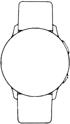
I have a Watch Icon that I use sometimes, but I’ve no idea how to get the circular face to fill correctly 
As for the Tickmarks interfering with the Numbers, I always lay the Numbers over the Tickmarks, so they don’t interfere.
Any ideas on what correct shape I would need to be able to grow to fill this Icon?
Oh, you have a new Follower now 
Thank you for your comments Mr Antisocial Guy, they are much appreciated
That’s a really cool Face, I love the flashing crossing lights, the little plane, and of course the train.
One thought for improvement if you don’t mind: how about raising the gates and changing the lights colour once the train has passed by? 
At the time I was working on that watch face, I had no knowledge of how to use Sequence Element. Actually I still don’t know a lot about it, I’m in the processes of learning it myself. I thought about trying to do like you suggest, but it was beyond my abilities at the time. And quite frankly, it’s beyond them still, but I keep trying to learn and improve my watch faces.
This is actually more my style of doing motion. BTW I can’t wear this face either because I end up watching the traffic light instead of looking at the time.
1 Like
Yeah might be tricky because of the animation (I assume this is an animated GIF, yes?). I would normally hide the gauge behind the background, but you can’t do that with an ani-GIF… I think you need a different watch design that would allow you to put a rectangle behind it. That might also lead to a different phone icon to match. I guess the easiest way using your watch design would be to make the face of it digital, and black out the side bits, so that you can use a rectangular gauge the width of the strap… I don’t have access to my design software on this computer, but I’ll see if I can come up with a solution for you at lunch time that illustrates how I would approach it. Then you can use it, not use it, or just use it as inspiration to create your own.
1 Like
I saw you publish this earlier and thought it was a nifty idea 
Thanks richiebee, most helpful 
I’m struggling to get the positioning right on those seconds, it just won’t rotate around the circumference like I want it to at all 
I like the idea of the background of your face but I find to my taste that there are too many movements and the eye is only attracted by the background which moves quickly. I will advise you to increase the duration of the animated gif
1 Like
So here is a couple of icons that would work to hide the edges of a rectangular progress bar… it’s a bit hastily put together so not exactly the prettiest, but you get the idea. Can probably clean it up for later if you want the graphics.
2 Likes
Thank you for your feedback, I’ll bear that in mind in future
That’s brilliant thank you richiebee, works a treat, and yes, of course I’d love the graphics please
Okay, I’m not sure how you’re going to see these to download, but here are white icons - I’ve done some work with the watch - the tolerances on the edge is tight, but I think the shape looks good - so, it is made so that the rectangle will fit underneath it, but only just. Be careful with placement to make sure the progress bar doesn’t stick out the side. It SHOULD be possible. If you can’t find a way to download these (I’m not sure how it’ll look, but right now all I can see is white on white!!!), let me know and we’ll figure out another way to get them to you. It’s about 90kB for the three, so should be easy to e-mail or whatever…
1 Like
Great, thank you so very much for all your time and effort in helping me out richiebee, it’s very much appreciated
1 Like