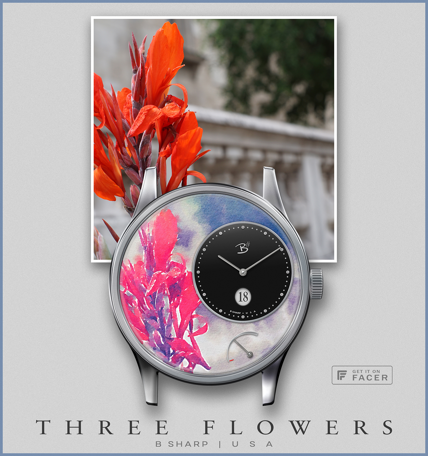
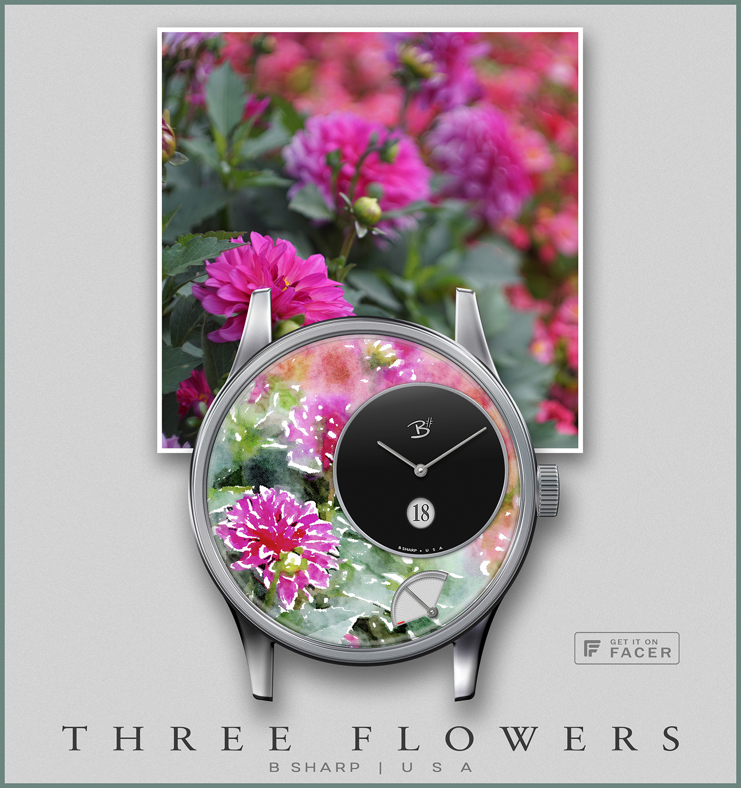
Continuing my Three Flowers collection. (Three Flowers comes from the title of a McCoy Tyner composition).
Series 1 featured light dials set into the watercolor design. Series 2 introduces 3 more “watercolored” flower photos this time with black clock dials, honestly I think I like the dark dials better… for smart watch anyway. 1st of the 3 in this series now published 


 I also think these promos would make great framed prints!


5 Likes
Outstanding.
Would it be wrong of me to suggest vertically aligning battery pivot with the ‘hands’ and date window, thou it would demand an increase to the battery arc?
Still epic, original and ought to be ‘Premium’, IMHO.
Thanks Rich, not wrong of you to suggest anything  but this was thoroughly considered I can assure you. I tend to find balance in the form of visual weight. Though the axis of the power and time hands is not in vertical alignment (by full intention), the vertical alignment of the weight of those elements feels perfectly balanced to me. Sometimes (most of the time) I like this sort of balance more than symmetry.