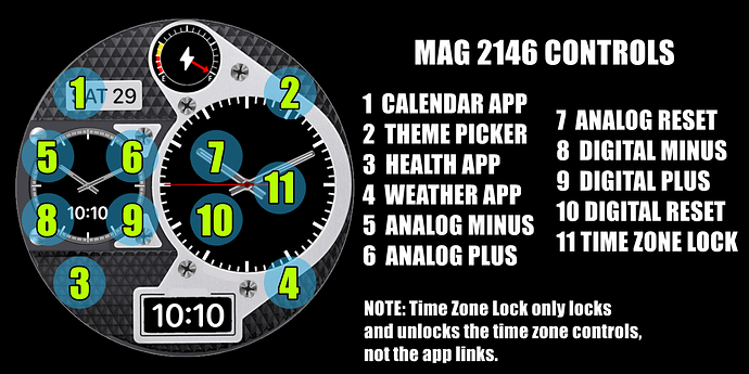
This may not be the prettiest watchface ever made, OK, it definitely isn’t pretty at all. But it has the ability to have 3 time zones at the same time. A BIG THANK YOU to @russellcresser for all his help with the maths on this. MAG 2146
Pretty neat, well done guys ![]()
It actually looks all right as well, but maybe add a textured background behind the dials/gauges ![]() That would make it look a lot better I think.
That would make it look a lot better I think.
Gizmo is right . I have one word . Gloss Black Guilloché . Probably one word in some Language . Run that out on the DE LUX version . If you can not find something you like I would gladly make one for you.
Just when you think you have cracked changing the time Zones Facer make a Tag for it . I wonder which one of us they are Spying on . ![]()
![]()
![]()
![]()
I kind of hate to make any changes now since I have published it and it’s gotten some syncs. I will have to think about it.
Don’t Change that one . Keep up with your Program . There is Plenty of Time :::)))
@russellcresser & @icrltd4 I compromised, I added a very dark texture that doesn’t distract from the dials but does add something to the look.
The sandy/grainy look works, nice one ![]()
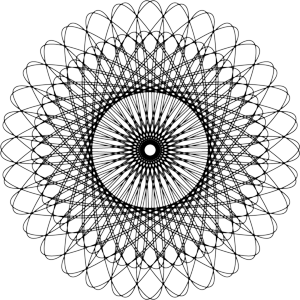
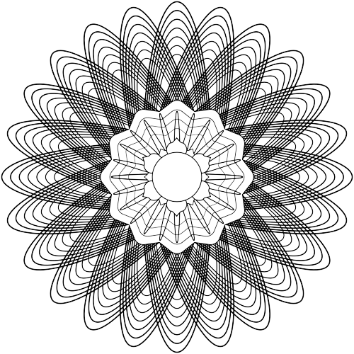
@russellcresser Here’s a couple of Guilloche for you -


Did You Make those ?
Nope, I found them and edited them, so they’re mine now, mine I tell you, all mine ![]()
![]()

Does this mean you are going to “rule the world” now? ![]()
![]()
![]()
Oh man, you’ve “blinded me with science” now! ![]()
I think it’s pretty nice. Clean, stylish look.

