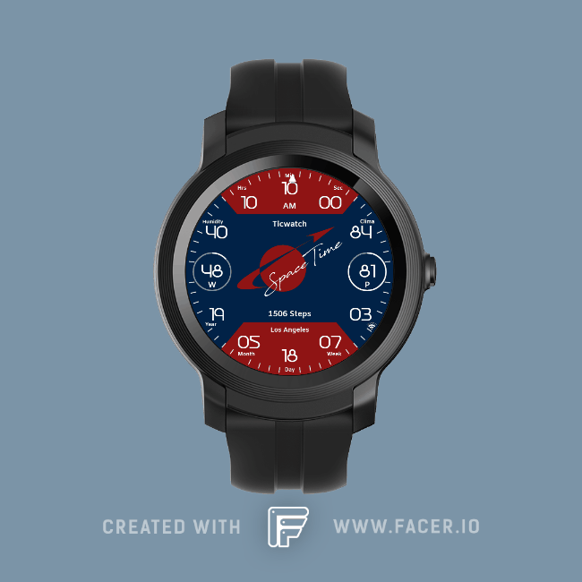
Here´s my 2nd entry for the “Space”-Theme. 
2 Likes
Let’s go !
Thank you
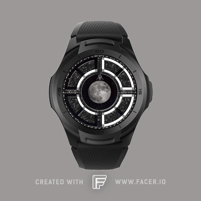
Here is my first entry for “Space” Theme.
-Planets as hour tickmarks
-Rockets as hands
-Moon phases in the lower circle
-Battery % in the right circle
-10k steps goal in the left one
-Date
https://mobvoi.facer.io/watchface/EN9FLEGBsu
Entry number two for the space theme! Went more minimal this time.
Hi all! We just released a new version that fixes the issues mentioned above about the edit button (which was non-functional, but still visible). To clarify, only authors are allowed to to edit their designs (the same as on the main Facer.io site).
We’re excited to see all of your designs starting to come in!!
1 Like
Thanks for the clarification, much appreciated.
1 Like
My entry:
3 Likes
Found out how the dimming feature worked today! Best experience ever with designing a watch face. Much easier than programming from code, javascript, css, etc. Starting to wish I owned a Wear OS smart watch.  Much easier to program on compared to the Fitbit Versa smart watch.
Anyways, I have updated my design to include the dimming feature. Do have a question, what is the purpose of the light vs dim feature? Is it like a Double Din Android Car Stereo where the screen would dim during night time and go back to bright during daytime?
1 Like
Here is my entry for Space Theme!!!
Earth around the sun. See the eclipse effect in the DIM mode
Design number 2:
2 Likes
Hi @jebscc
Most smartwatches have an Always On Display (AOD) feature but this obviously uses more battery, so the idea is you have a dimmed version for when you’re not actually looking at or using your watch, that then switches to the active/light version when you do look at or use your watch’s screen.
Also the more use of brighter/white colours on the screen tends to use more battery power, so consider this when designing the Dim mode.
Thank you @dubblebee. I have updated my watchface to reflect active/lite depending on usage as you stated. This is defiantly a new experience which I love. Wonder why I didn’t start with designing for these types of smartwatches before. Why easier then Fitbit OS. Just need to figure out if it is possible to position text/icons based on if the watch has a circle/square interface. Currently, my design looks a little weird on the square displays.
Entry number 2
Turn dim mode on and off to shake
3 Likes
Here´s my 3rd entry for the “Space”-Theme.
2 Likes
Yes it’s definitely possible, just use the #ZISROUND# tag e.g. for the X position:
$#ZISROUND=1?160:80$
(If the display is round, position the text on x:160, if its square, position the text at x:80)
Thank you for your help @dubblebee! I was able to modify and improve my watchface. It now supports both round and square screens and looks a lot better!
Not sure how this would look like on the official watch as the only smartwatch I own is the Fitbit Versa.
Did come up with the following formula to remove one of the text objects which should improve battery usage. What I was able to do is to create one text object with formula $#ZLP#=true&&#ZISROUND#=true?139:#ZLP#=true&&#ZISROUND#=false?115:#ZLP#=false&&#ZISROUND#=true?274:300$
This allows me to detect if the watch is either active/dim mode and also move the text to another area of the screen depending what mode I am in. At least I would think having two text objects on the clockface to read current weather condition (only one of them would display depending if we are in either active/dim mode) would effect battery life compared to only having one text object.
1 Like
4 Likes
1 Like
1 Like