bradtc is a nice guy, and very helpful, I’m sure he’ll sort it out for you real soon, maybe even make all the text bigger for you 
Damn, need to dig into all this further.
It looked good this morning as well:
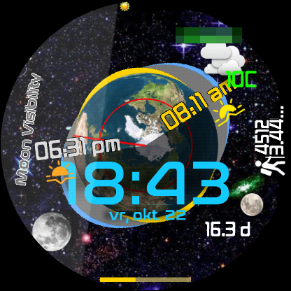
However, this evening some stuff was off:

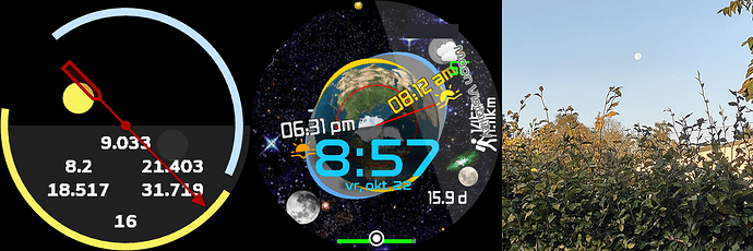
As you can see it’s past sunset, but the location is still in the light part. Also, the moon was in view, but according to “the internet”, moon rise would be 19:30 here today.
Still, great stuff!
I made a lite version for myself to look at all the sunny/moony stuff when I have time 

ok, now i understand 


 only top quality

Some nice Faces you have on your profile @alsx65 and much respect to you for the lucky-andrei tribute Face 
Thanks for the update @ThaMattie. Nice to see another data point.
I am seeing a weird anomoly though. At your display time of 18:43, which is past the 6:31pm sunset time, your red longitude line should be displayed slightly past the 6:31pm suset time, but instead it is before the sunset. I am wondering, do you have daylight savings time there in Reimst? If u don’t, that might be it. Daylight savings time ends for the year after this weekend over here, so things might balance out, but I still may make some changes relative to that so it is universally correct.
I’m interested in how your lite version works out. Maybe you can figure out that lunar 27 vs 27.322 day orbital period accuracy issue the model has. I’m still trying to figure it out myself.
Yeah it’s daylights savings at the moment. We go back on 30/31 October
As for my lite version, I barely have time so doubt it will result in anything soon
Okay, thank you Brad, I really like the whole thing.
thanks for your appreciation , i try to have some for fun
I enough of a geek to truly love this face! Thank you for making it.
Welcome to the Community kd7eir
I like it!
The always on screen is fantastic with all the important info bright and clear!
Of course the main screen is busy which I like.
Thanks
Hey @garf44,
I messed around with the text sizes and fonts trying to make it a little easier to read. Hopefully it will work better for you.
Nice work @bradtc but maybe untick the Fixed Width box on the Texts so everything fits in nicely 
Cool beans, I will check it out, Thank You
much better to read, I appreciate it.
@icrltd4 , funny I have never unticked that fixed width box before in any face. Never actually noticed it. Thanks for showing me something new! 

(Sorry, I love that little gif  )
)
