Please let me know your thoughts/opinions/ideas on this one guys -
I like the overall look of the design but I would never use it. After opening it up on the computer and enlarging it I could tell that the rings are the day, date, and month. I still could not make out the numbers on the date. Also the temperature and weather conditions text box is not large enough. Here is a screenshot of it clipping (…) on thunderstorms.
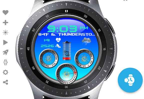
I use a small trick to make sure I have enough room in the wx condition text area. Instead of putting in the expression I just put the words, “HEAVY INTENSITY RAIN” in the spot I’m going to use. (That’s the longest wx condition I’ve ever seen on my watch.) Then I make sure my text box is at least 350 in width and then adjust the font size to allow my test phrase to fit completely. Once I do that I change it to #WCCT# and run with it.
Again I like the look of the face, it’s just too small of writing for me to be able to read.
1 Like
Thanks Mr Antisocial Guy, I noticed the too small Date text after I synced it last night, but was just getting ready for bed by then. I’ll definitely be sorting it out today at some point, and didn’t notice that about the Weather, so thanks again 
Changed things around a bit and am quite pleased with the final outcome -
2 Likes
Loving those wheels. The icons are also pretty cool.
The background is a bit too blue to me. But then, I like m dark. 
1 Like
thanks Dodinas, it was a total change from what I normally do lol
1 Like
Very Nice!
1 Like
@mrantisocialguy Thank you Sir, I even took onboard your “HEAVY INTENSITY RAIN” comment, and it works a treat…always a pleasure to be learning things from you guys thank you 
The name alone should get it into the top 100 
1 Like