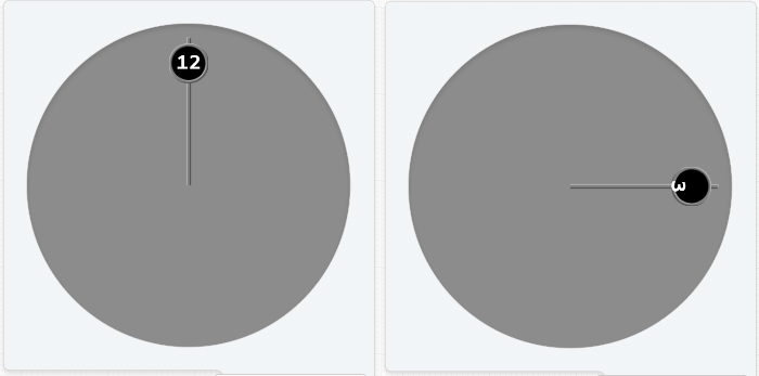
I’m working on a face and basically what I want to do is have an hour hand and minute hand rotating, each hand has a circle to display the time (hour or minute), is there a way to essentially attach an object to another object to follow it’s movements, or make the text object that displays the time rotate around the watch face instead of spin
Not so much attach but it is possible to make an element rotate at the same rate so that it looks like it is.
You can do this by using expressions for the item’s x and y positions.
Suppose the distances from the centre of the hour and minute hands to the centre of the time displays are 100 and 140 pixels respectively, then:
Hour Text: #Db#
X position: (160+100sin(rad(#DWFHS#)))
Y position: (160-100cos(rad(#DWFHS#)))
Minute Text: #Dm#
X position: (160+140sin(rad(#DWFMS#)))
Y position: (160-140cos(rad(#DWFMS#)))
Set rotation of hour hand to: #DWFHS#
and minute hand to: #DWFMS#
Set justification of text to centre.
You may need to experiment a bit with the constants to get the text exactly where you want it.
I hope that helps.

Thanks for the response, I set it all up and aligned the text, it rotates and follows the hand but it lowers out of the circle at 3 and 9, almost like it’s rotating on a ellipse instead of a circle, it lines right back up at 12 and 6, not quite sure why, I can probably just easily do a work around using the same expression but have the circle the time will be in separate from the hand and match it with the exact expression of the time
edit: tried having the circle separate but just the time moves down
From the photo it looks like you are also rotating the text, is that right? If so, you don’t need to. You can just leave the text rotation at 0.
Now the other issue might be that the centre of the text object is not in fact centred in the middle of the text. This might also be a function of the font. If it is not centred then you may need to add a further small sinusoidal correction term to each of the X and Y positions to compensate.
Edit: I think I remember reading that there is a way to centre the text vertically as well - part of the Creator interface; an alignment widget (?)
Ok I’ll give it a look, thanks for all the help
Ok. I was wrong about the widget to adjust vertical alignment of text ( It does not appear to exist; I must have been thinking of something else  ).
).
However, the solution is much simpler than I thought; you just need to apply a constant Y offset.
For expressions, see inspection mode of test face below:
thank you for all the help, it worked well and just finished and published
Very nice! I like the overall design and the hand displays are great.
Just a small point, and of course it does not matter, but normally one expects to see the hour hand shorter than the minute hand …
Anyway, a great job, well done!

Oh your totally right I kinda flipped them, thanks, I’ll swap the codes around
Hey great job. I like that face. I’m glad someone was able to help you figure out the code for it. Well done.
Hi there. I just wanted to thank you so much for posting this. I’ve been wanting so badly to learn how to do this 
Hi there. How would this work with Fitface? I’m trying to figure it out, but can’t. Thanks 
Thanks for this, I’ve been playing around with it on what may end up being my 3rd face.
