I dont usually do anything realistic- so i would love some feedback on how this looks! this is my second analog face, i’m usually more partial to digital, but i wanted something to go with some earrings so i tried to make this!
Edit: for some reason the version I’m synching is an old version, hope it’s updated for you guys!
Hi,
Good job on the woodgrain. Perhaps more contrast is needed between the background and other elements. Maybe bolding the date with different font would help if you want to keep it in the same color family. I’m not sure if that is a logo or info above the “6”.
Thank you so much! I was thinking of anhogh contrast and I honestly wasn’t sure how it looked, so I went with the dark, I can play around with the contrast more.
Also above the six is a logo I’m testing out, not completely sold on it yet, but I want to keep any logo lower profile on most, so dark and or inlaid into my design.
I definitely like where you’re going with this face. I love a good wood watch face, I have a pretty cherry one.
If I were to make some suggestions I’d say the numbers are a bit to dark for me. They don’t create enough contrast since the wood is a bit on the darker side and I believe you used the shadow feature since the numbers are so dark the shadow just makes them a bit blurry since it’s difficult to separate the number with the shadow. Lightening up the numbers or removing the shadow should help this.
Another thing I noticed is that your logo at the top is above your hands in the layer list. Typically the hands should be above any graphics like that if your going for a realistic look. Unless of course you wanted the logo to be printed on the glass above the hands but if that were the case you should do a light shine to give the illusion that there is glass over the face.
I generally use Photoshop for graphics, but since I’m on vacation I’ve actually been doing this all using paint 3d and my tears, when I’m done with my vacation I’ll go back to good old Photoshop!
I actually want the top icon to just be a nice contrasting decoration, my logo is the botttom dark one but the icon being over the hands is a mistake…
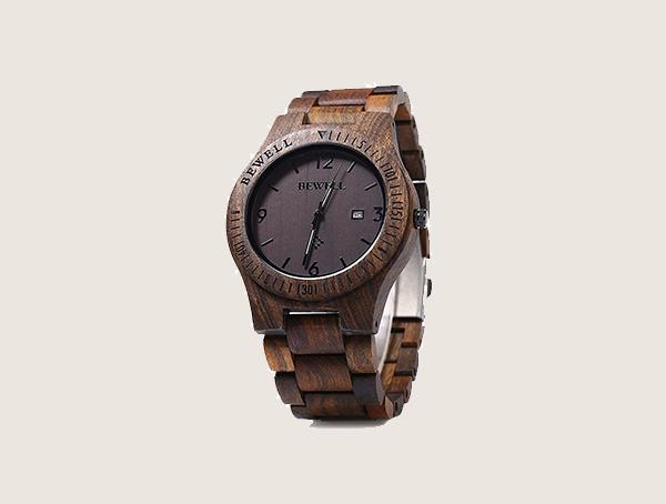
Yeah I was trying to go for something like this one,
But it’s hard to do well… For me at least
EDIT:
Updated it with upped contrast and a bit of a changed the hour and minute hands- what do you think? Sorry for asking for all of this feedback- I dont do realism much, so i want to learn