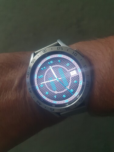
I have two creations for example
Red one is Brilliant . For me the battery gauges the same width as the blue ones .
the red ones are once as wide as the blue ones
Ha Ha . They look wider to me for some reason . Probably the Colour . ![]()
![]()
blue ones have 3 columns and red ones have 5 columns.
Hey, I like the Blue one, but really nice work on them both…I was first to post a comment on the Blue one for you, it looks pretty cool thanks ![]()
I thank you. I didn’t expect to like it so much. It was the most boring watch face for me, from which came double red, where I could be more creative and didn’t have to deal with the hands, I don’t enjoy creating hands, I can’t do them. even on the blue one, I feel that they are unbalanced and look like any other watch. But I’m glad that others still like it. Thank you.
I love them! I have to echo others and say the width of the blue battery gauges are more aesthetically pleasing.
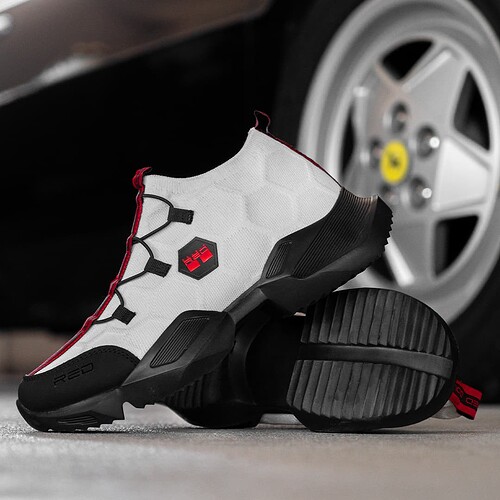
But again, Double Red is not completely out of my head and it is inspired by the brand of shoes and clothes with the same name. ![]()
![]()
![]()
Those are pretty cool ![]()
![]()
Remarkable where designers sometimes get there inspiration ![]()
I grab every idea, it’s hard to come up with an idea, once I come up with something, I look at the facer to see how much there is and how it’s processed and either decide to make my own version or not. But one’s own idea, one looks and sees patterns, inspiration and so on in everything. I’m sure you know it too.
I have two more new again similar faces without AOD.
both are very nice, prefere the second one ![]()
so I have the second one in my favorites.
Now I have something in front of me that I’m really looking forward to. So the end of the two is thrown off. I’m going to take a break today and tomorrow I’ll start another one… And you wouldn’t believe what inspired me this time. ![]()
![]()
![]()
![]()
surprise me ![]()
![]()
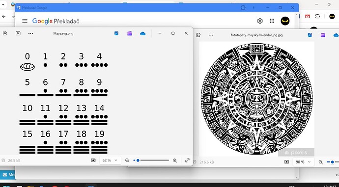
The Mayan Number System and the Mayan Calendar. ![]()
![]()
![]()
Looks interesting!
I was interested too. so google, something to read and an idea was born which I accepted with enthusiasm.


