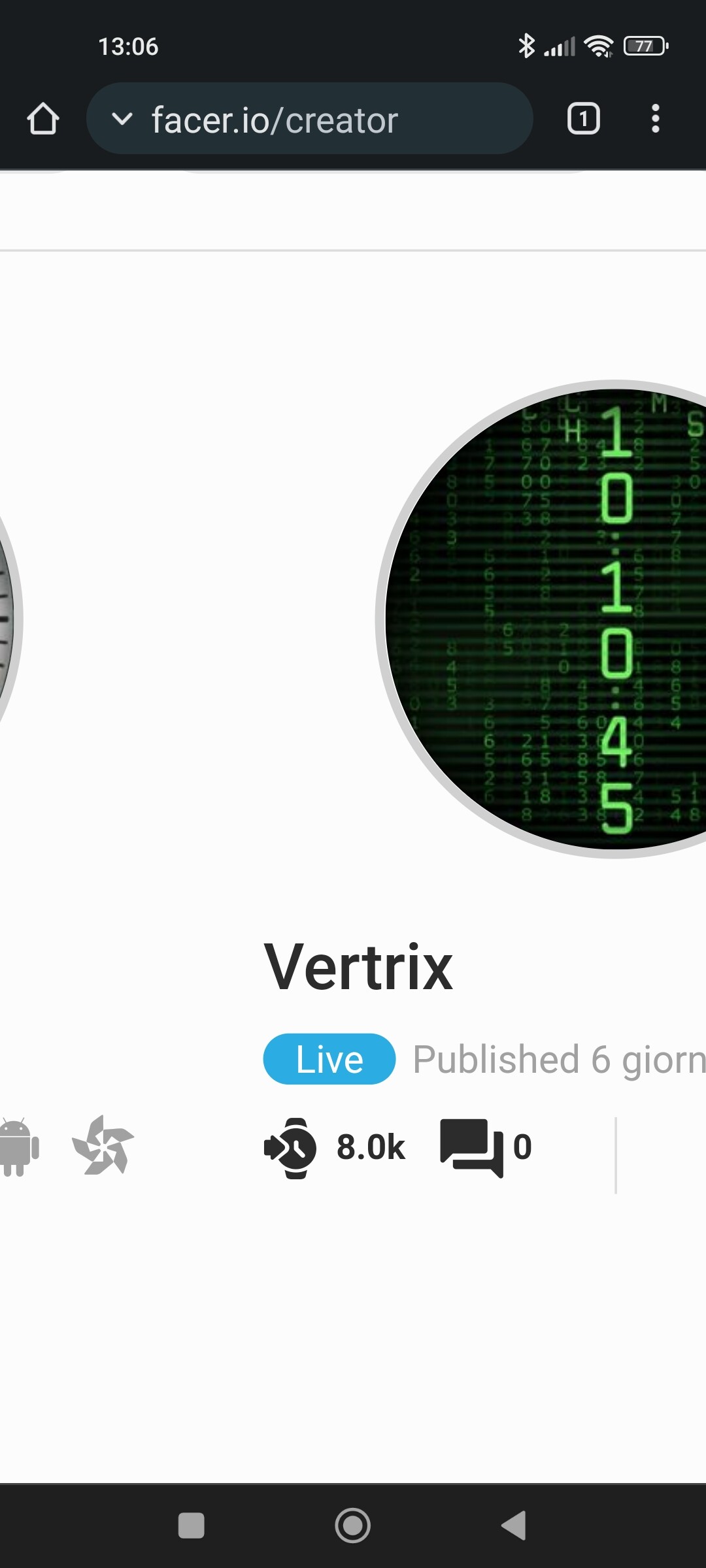
just some fun with vertical fonts , for personal use and educational puorpose only 
5 Likes
Personally, I would slow the background down some or put in a Matrix .gif animation. After that I would leave the rest as it is and publish that one!
3 Likes
thx for tips ,slowed animation but no gif , on ticwatch gif lag too much, take the occasion to let link for new vertical font
5 Likes
The background speed is right on now! Now you need to publish it. 
2 Likes
Awesome idea. Vertical fonts were made for that. 
2 Likes
Looks great, well done, I’d remove the colons ( : ) between the Time Elements myself though, I think they look strange on their side lol
2 Likes
@alsx65
Now that @icrltd4 mentioned it…Maybe substitute the negitive sign in their place. That would be the same as a dash mark between each group.
1 Like
Glad you like guys and focus on tips,damn the coloumn i forgot to center them when i rotate the fonts in fontstruct  , i’ll go for a negative sign .Btw it will pubblish only if you want sync it to test if gw4 run smooth,on ticwatch works fine
3 Likes
Brilliant work . The second one is more Readable for me . Why are so many people doing Matrix stuff .Is it an anniversary or a New Film out . Thanks for the fonts .
2 Likes
Cool . I like that one . That was a Few Watches ago now then . ::))
2 Likes
I want to thx you all guys for tips suggestions and support ,. I think is a good thing share the syncs numbers after 3 weeks since i consider it a team work
Many thx
5 Likes
Wow. 

2 Likes
I can only repeat that. Wow. And congratulations.
My all faces together only recently reached 10k  (and 8k of it was from apple)
3 Likes
Lol you are a Samsung designer secret agent  they keep you hidden
3 Likes
When you mention GWD, it has its own pros and cons. The worst thing is, it has been discontinued.
So I spy for a forgotten empire
3 Likes
 WOW!!! Sometimes the stars line up and this is surely one of those times. Congratulations on the fine work and response of the end users!!!
3 Likes