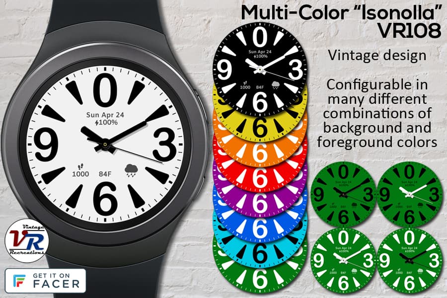
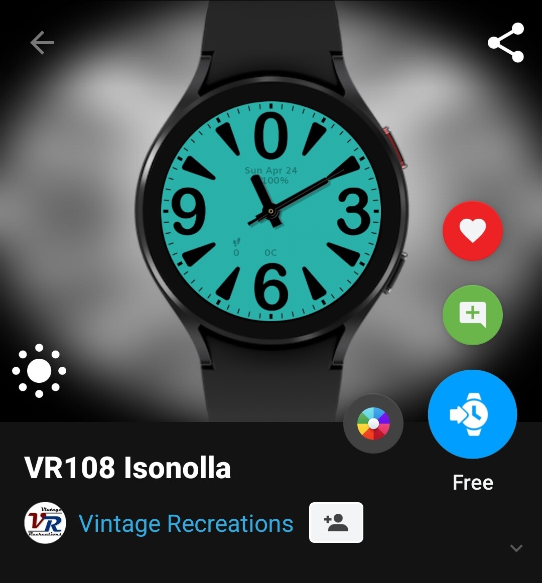
Probably the most plain face I’ve recreated, but the color options are many and nice. Vintage piece from the Soviet era. Giant digits and markers, perfect for those with vision difficulties. Configurable with multiple color options. I’m still trying to stick to my vintage minimalist ideology, which is why the 5 complications that make this overly plain watch more functional are non-obtrusive and fade down after 4 seconds. I don’t like them any darker or larger.
First time I’m also making product cards (for a lack of better words) to go with the face. These suckers took twice as long as the watch itself 
8 Likes
Also… an interesting find during the development of this face to note, I’m curious what others have experienced with this issue.
As I mentioned, the complications fade to keep them unobtrusive (and make me happy). Easy to do with opacity, except for the darned weather icon. So instead I have a separate layer just above the icon, with just a patch of color covering the icon, in the same exact off-white color as the background (both setup for theme colors). The patch is just large enough to cover the icon with a small overlap.
Works perfectly on my GW1. Works almost perfectly on my GW4, except for an annoying dark “border” that shows around the patch, regardless of the theme color. The only way I was able to make the annoying border go away was to make the patch slightly larger in order to give it a 9px feather all around.
Anyone run into this? I remember something similar with “lines” was once happening to fonts in the GW4.
And… 10 points to anyone who can figure out the name 


4 Likes
The name I’m guessing refers to the large size?
How did you manage to apply the different theme colours on a free face please?
2 Likes
Who said it’s free? I’ll send you an invoice! 
Seriously though, I didn’t do anything different, Facer must be having a brainfart.
1 Like
Use a shape layer as a cover for the Weather icon. They do not have a feather edge.
2 Likes
Slightly modified version of its original vintage name, translated to Finnish.
Why?
Why not, it sounds neat!
1 Like
Tried it, it’s much worse: I can’t get its color to match my dial’s color, made even more complicated by the dial (and this magic patch) being controlled by theme colors.
So… I have to stick with a separate PNG image layer with a feathered patch color-matched to the dial in Photoshop, which works well. Just disappointed the un-feathered patch has lines around it.
PS-- it’s quiet on here…
2 Likes