Hello everybody,
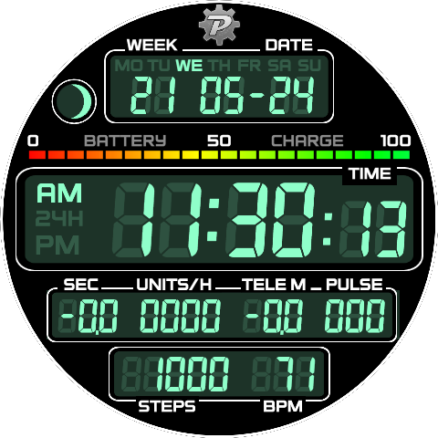
may I ask for some advice, how to balance out a little unspent area on a watchface with something fitting into the overal idea? I intended to replace analog faces with multiple meter bezels of bad readability on a small pixelated screen with a digital equivalent. Focused mainly on time related values, but in the end still added things like moon, steps and heart rate. I cant decide how to restore the symmetry best, to remove the moon phase indicator (which I only picked as nice placeholder), or what suitable put on the other side. I did not open the box with weather toys as they would need to be more than one and at least one more digital field.
4 Likes
This is just me, but I would get rid of the moon phase and window and widen the date window to take up the extra space. Maybe even make the date window with angled sides narrow at the top and wider at the bottom to help fill the gap.
5 Likes
That is a good idea, I could maybe even win some space for extra digits (for temp or something ![]() )
)
3 Likes
i prefer to battery bar not colored, just green like other digits.
I like your watch face, reminded me of the DeLorean’s time circuit panel

2 Likes
Keep the Moon . Beating Heart in on the Right . Pixel Special .
2 Likes
agree with @mrantisocialguy, I think rounding off the top and bottom windows would look great. Overall I like it a lot!
3 Likes
LOL
I don’t think we’ll be helpful. Every one of us will give a different answer.
I think you have to decide what kind of data you find important.
Speaking for myself:
I never understood why the moonphase is important, I never needed that info.
But I need current temperature and min/max temperature for the day, I find it very useful.
I don’t need seconds, what’s the point of knowing seconds?
But I’m using health info, the more the better.
I also like having phone battery level, it warns me to recharge when I’m low on energy.
6 Likes
Moon phase is more for those who are into astronomical observation. If you use a telescope at night to look at the stars, a new moon night is best because of the minimal competing light. Since I’ve been involved with people as a service worker and also in emergency service as EMA it’s nice to know when the full moon is due to the correlation of full moons and people doing stupid stuff.
5 Likes
I am a Lunatic and also like a Seconds hand to indicate when my watch has Crashed . ![]()
![]()
![]()
![]()
4 Likes

That watchface cannot be done for Apple watch due to their draconian requirements for 3rd party apps like Facer.
2 Likes
for samsung watch 4 classic and active 2?
How about this.
3 Likes
it is really very nice bro. but I still request for asus
1 Like
Thanks all for helpful opinions, I enhanced the upper field with weather data and can move on to another variation. Case closed…
4 Likes
That looks like you intended to do that from the start!
2 Likes
Actually I first made it for myself and week number is important data in my work, so I made me a duplicate with that and this adjusted for looks and for general purpose. I work now on completely civil version without the “no-pro-chrono” feature and on a pro version with regular stopwatch too.
3 Likes
And now I want to make yet another analog semi-skeleton face. You bastards ![]()
1 Like
This is what I came up with.
Ok, so it looks nothing like the original but I swear it started out like that.
There are a lot of subtle things I did in this, like the hour and minute hands change at certain times to follow the light and all shadows do it too. And of course some slight gold reflections on the logo and markers.
The balance wheel looks a bit slow in the preview but it is actually faster on the actual watch.
4 Likes
Looks very nice to me! I like the light and shadow effects!
1 Like