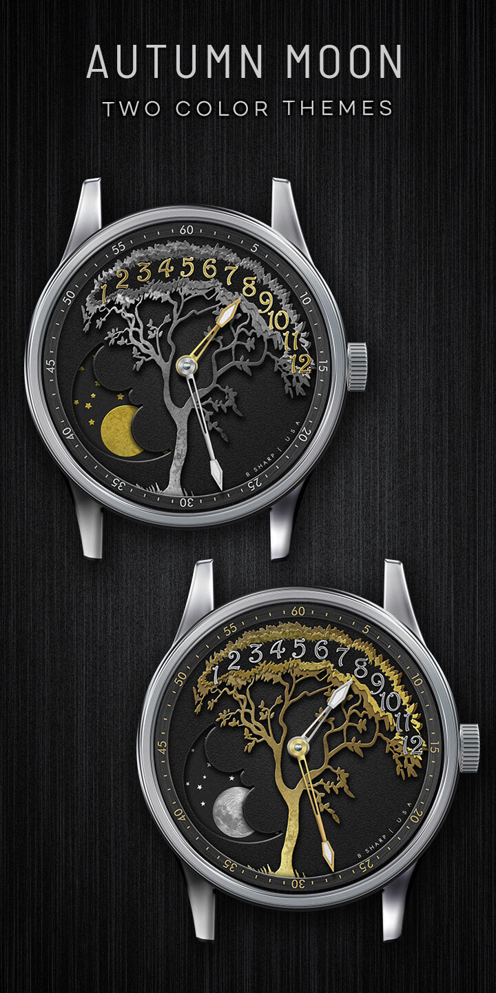
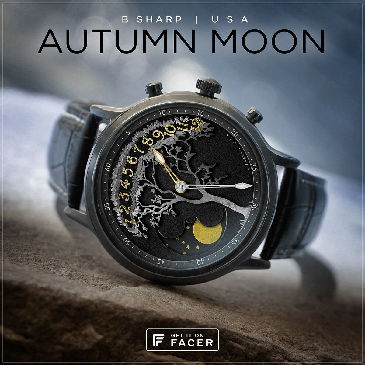
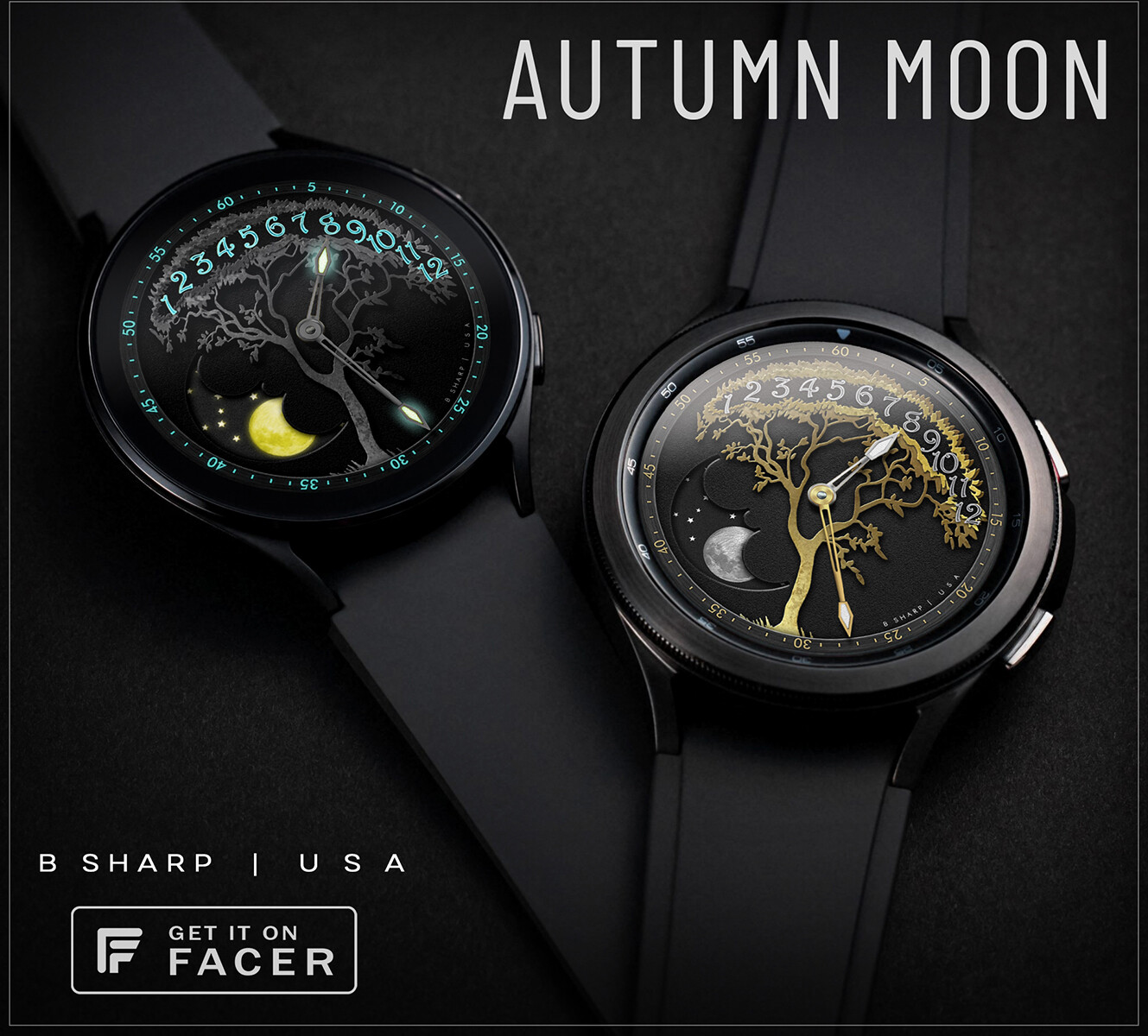
Here is the 2nd of my new autumn themed faces. This one is more of an art-piece in design. The time is indicated by a jumping retrograde hour hand (it indicates the current hour without sweeping towards the next) and conventional center minutes hand. There are two color themes and the hands are color coded to the minutes/hours respectively within each theme to make it easy to read the time.
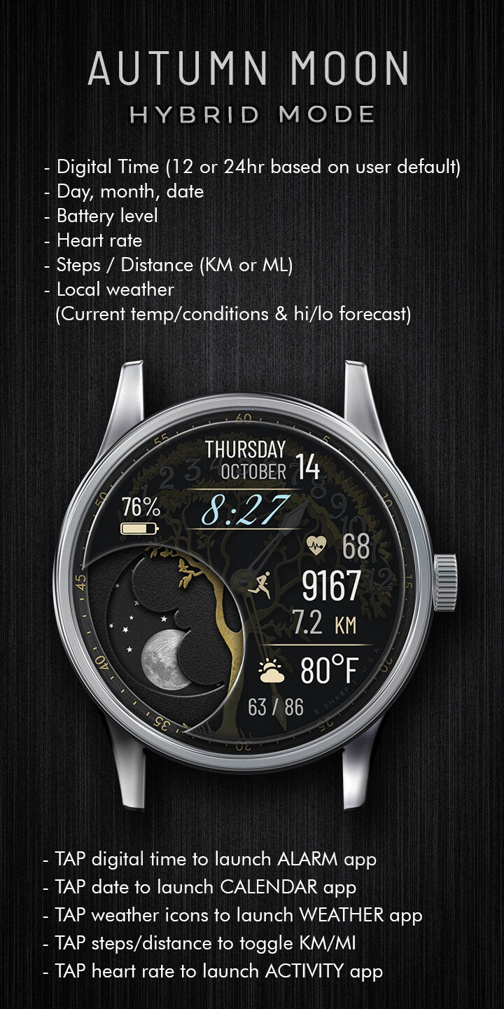
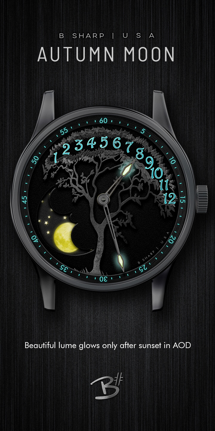
There is a big moon phase, and a selectable Hybrid Mode with all the essential info in large, easy to read text. This one also has a more elaborate lume which glows in AOD after sunset.
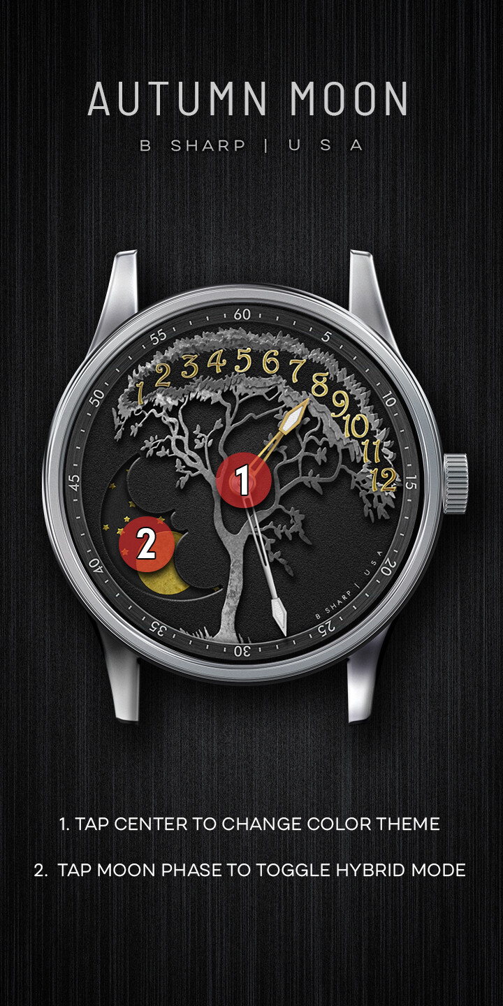
***make sure you check the watch guide pics for TAP instructions and more info.
Enjoy! And be sure to follow B Sharp to never miss a new release! And on instagram:https://www.instagram.com/bsharpwatches
Smart watch faces for watch lovers!
5 Likes
Great stuff, I have to comment though, about the double bezel, maybe not really necessary  Love the style and design though
1 Like
thanks! do you mean the minutes ring? Unfortunately this is yet another example of why the smart watch makers should leave marking OFF of the case. This design totally calls for minutes tracks to help with clarity because of the retrograde hours. I agree it’s undermined by say the Galaxy watch that has those same numbers printed on the case. But many watches don’t have the numbers and so they need to be there. The watch makers should leave it a blank canvas, but for some reason they don’t. It’s like when they are designing the watch and doing the renderings they always imagine a black screen and think it’s not interesting enough so they decorate the case, forgetting that there will actually be a watch face in that blank space!
2 Likes
Love this one! Nice silver/gold combi and that moon fits really nice there!
2 Likes
Both of my Samsungs have the markings and both Fossils are blank around the screen. Which just proves no one can make a watch face that is perfect for all watch brands and styles. Plus the reason OEM watch faces look so good is because they are designed for that watch only.
It’s true that some of the OEM faces are a super fit for their respective watches, but even a few of the Samsung (or ticwatch pro) OEM faces are digital where the numbers on the bezel have zero reason to be there.
But that gets to my point. They could leave the case neutral and put those numbers on the faces instead and the oems would look just as good.
Or make interchangeable bezels, like my wife’s Michael Kors watch has
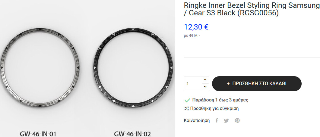
You can actually purchase different bezels on Amazon. I’ll be getting one soon, if I remember correctly, it’s only about £12:95.
yeah, I’ve seen some photos of pretty nice aftermarket bezels. But most don’t cover the inner bezel of the Galaxy series, that’s where the numbers are. But that’s only good for my watch (well, If I had a galaxy) but it still leaves the numbers on millions of watches out there messing up the intended look of the majority of face designs. My gripe remains, they should leave the markings OFF the watches.
2 Likes
Now you mentioned the inner bezel, I’m going to get me this nice black sticker 
1 Like
those look pretty nice! If I was to ever get a Galaxy 4 I’d get the classic and look for an inner ring like this but plain brushed steel. This style is nice and suits a lot of my kind of designs, but it still imposes itself on the face. What if the face already has a chapter ring like this? Even the otherwise beautiful Summit2 has got annoying tic marks printed. It makes any face that has it’s own tic marks look kind of dumb because of all the redundant tic marks.
1 Like
I think of those unlabeled tickmarks as an invitation to make better use of the dial area without them.
1 Like
Definitely! But still, any face that doesn’t have central hands is incompatible with any bezel markings. If you are only designing for your own watch than absolutely those rings look great and free up more real estate on the screen for your design. I sometimes design specifically for my Summit2 but then those faces don’t look quite as balanced on the fossil or Huawei because they don’t have the OEM markings. So then I have to add a tap function to unhide some markings for those watches. I just think that the watch makers should be factoring in the wide open world of 3rd party faces as one of the most essential reasons to even have a smart watch.
2 Likes