I’ve been working on an idea with fully exposed calendar wheels, which is something I always like and enjoy making. The final version has a tinted glass dial over the top with openings for the date instead of the red frame. (and some other details are different). But I like this totally open look too and thought it had kind of a working prototype feel to it so I thought I’d release a version like this.
Enjoy! And be sure to follow B Sharp to never miss a new release! And on instagram:https://www.instagram.com/bsharpwatches
Smart watch faces for watch lovers!
8 Likes
Muy buena idea, con los calendarios!!!
Esto es algo nuevo, para mi…muy bueno !
Un estilo llamativo!!!  :головокружительный:
Todo un éxito !
Cordialmente. …
2 Likes
I’m impressed! Not only sharp looking (no pun intended) but very original as well.
3 Likes
Well, not my style, yet still educational. I did not search for it, but now I finaly understand how the two segment date digits actually work.
2 Likes
Very impressive for sure, always seems strange having nothing happen when tapping on your logo 
1 Like
this is great looking, fantastic concept.
2 Likes
thanks guys! Making wheels is always a fun thing for me. In photoshop I have to create templates and actions and a process to make it absolutely precise which makes it feel a little more like watchmaking than graphic design 
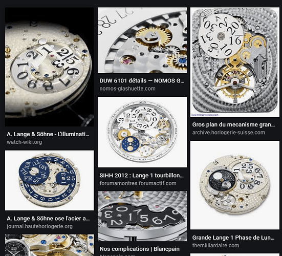
@petruuccios the complication is generally referred to as Big Date. When there is a single date wheel the text necessarily has to be small or the numbers would be too crowded. So to make for a larger display various two wheel solutions are devised. I gather it’s much more complicated and expensive to make in a mechanical watch. But for us it’s all the same  Many times we do it simply with text layers, but the wheels are so much more fun so I like to make them. There are many different solutions to how to divide the 1s and 10s over the two wheels and lay out how they overlap or combine to display the date. If you google search “big date watch” or something like that you can find a bunch of examples like these.
A Lange & Sohne are known for big dates. The wheel configuration I used for the date is based on one of theirs. Though I can’t remember which watch. I found a picture I had saved of just the movement of one of their watches that showed the date wheels. I’ve done a few other configurations of big dates too, but this is my favorite because it takes up so little space but gives a large text size. I imagine it’s probably one of the more difficult ones to do on a mechanical watch which is why it’s not common.
3 Likes
Good morning…
Very good work … and the most important thing is that you were able to build all your ideas, in a fabulous clock design !!!

 :головокружительный:

