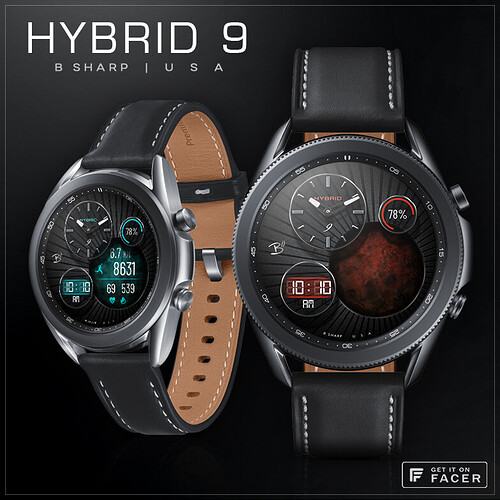
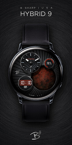
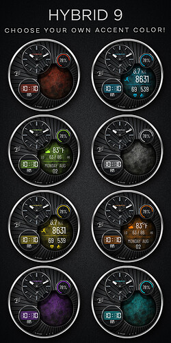
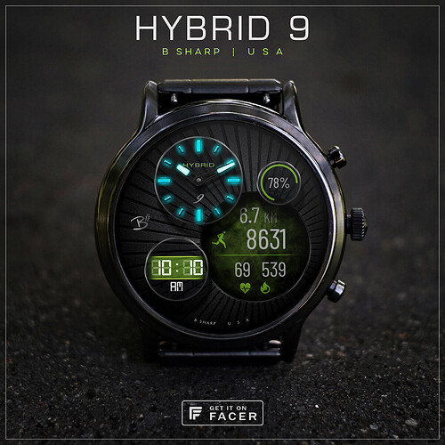
Here’s the 9th in the B# Hybrid series and the 3rd in the current stylistic mold of black base with raised glass dials and user selected accent colors. #10 is going in a different direction.
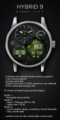
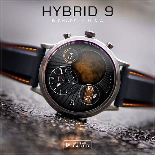
This one also has something not typical to B# faces… non-gear related animation! I’m calling this a Tri-Mode Space Portal Display 
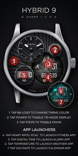
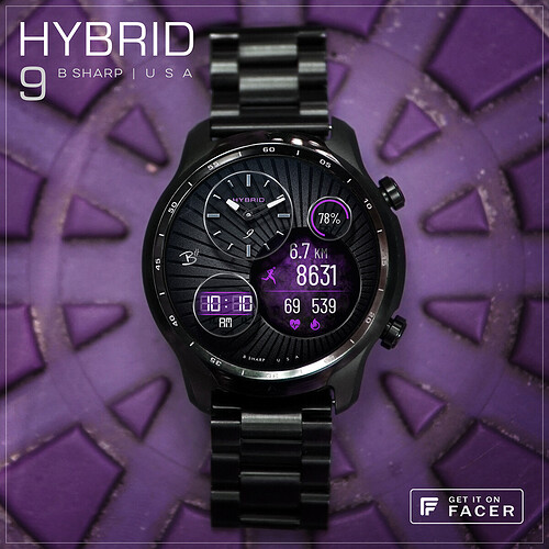
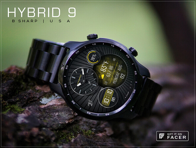
 Mode 1 is just an open view into the portal, Mode 2 is the activity tracking display and Mode 3 is the weather display. The remaining 3 dials are assigned to digital and analog time, and battery meter.
There’s also a nice lume for AOD.
I actually completed # 7,8, and 9 all around the same time in early June so I’ve had a chance to wear them all for a while, and this one though maybe not my usual style is still my favorite of the three.
***** Check the pics below for more info and tap instructions!
Enjoy! And be sure to follow B Sharp to never miss a new release! And on instagram:https://www.instagram.com/bsharpwatches
Smart watch faces for watch lovers!
4 Likes
Very nice. Like the drop shadow used to create the raised elements, and inner shadow for the recessed graphics! Might give that a go myself…, top work as always. Cheers. Rich
2 Likes
Very nice work as always kvansant, I like the 3D look to it, especially how the 3 smaller dials seem to float over the larger one…excellent 
1 Like
thanks Rich, I’ve been kind of obsessed with glass dials and shadows. It’s just a fun thing to play around with in PS.
thanks! they are floating aren’t they… maybe I should have put some mounts on them. But I guess if I can have a Tri-Mode Space Portal I can have magically suspended glass dials 
1 Like
Hm, now I decided I need to finaly learn how to make this kind of glow 
1 Like
I think the effect is brilliant, whether intended or not, but yes, as Rich said, it’s an excellent illustration on the correct way to use shadows…bravo Sir 

1 Like
you mean the lume? I do it 100% through the tools in the PS layer styles (that’s where I do almost all my graphics detailing). But you can also do it using a duplicate layer and gaussian blur as a starting point.
2 Likes
Very nice, I like the combination of the “empty” part (when it’s in Mode 1) and the dials/info bits.
Also some nice color variations, and the background works really well, drawing the focus to the portal part.
2 Likes
thanks Mattie! that’s my favorite mode too 
1 Like
@kvansant absolute beauty with perfection. As always neat and clean.
1 Like

 Mode 1 is just an open view into the portal, Mode 2 is the activity tracking display and Mode 3 is the weather display. The remaining 3 dials are assigned to digital and analog time, and battery meter.