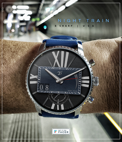
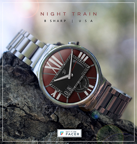
This watch began with elements from two beautiful watches in mind. The oversized Roman numerals from the Cartier watch that was the basis of my Inspiration # 15 design, and the raised sub dials of the Speake-Marin London Chronograph. Roman numerals usually give a more formal and classical look which isn’t what I had in mind, so through type style and by including more modern elements such as the raised dial and split seconds I tried to give it an overall contemporary character. The center dial began as a square but was resized as rectangle to align the corners with the hour markers underneath. I usually prefer big date when possible, just because it’s easier to read on the small screen, but also mechanically it makes more sense with this placement. And of course battery level is the other essential for me.
The name Night Train comes from a composition I closely associate with the great pianist Oscar Peterson. Sometimes naming a watch is harder than designing it  This time the name came early and partially guided me in the design. A common term for the seconds/minutes indices is “tracks”, so these tracks are purposefully intended to be evocative of the railroad theme.
There is a version of the black/blue with lume and one without lume. There’s also a red version on the way.
Enjoy!
Here is a red variation of Night Train. I’ve always steered away from red for some reason. My go-to color themes tend to be primarily involving blacks/blues/greys. But suddenly I’m compelled to explore red and if it’s the right shade and the right design I’m really liking how it looks. But I don’t think the lume looks great with the red here so for now only a non-lume version is published. Lume version is waiting in the wings though should anyone really want to have it. Enjoy!
1 Like
I don’t know, I like the red version more than the blue one, it seems to be more in line with the railway theme 
1 Like
@lucky.andrei I think I like the red a little more too  I played around with quite a few variations, the way I build and organize the layers in Photoshop makes it very convenient to experiment with different textures or colors, black on black also looks good but I think the two tone accentuates the depth of the raised dial a little bit more.
1 Like
I’m not a fan of the rectangle, but I really like the big roman numerals.
I’m also a “blue” kind of guy, but the red looks good here as well.
thanks @ThaMattie The rectangle started as a square, didn’t like that, tried various ovals, but didn’t like the way round was looking, or rather it’s not the direction I wanted to take this one. I liked the look of the rectangle being taller but once the tracks were drawn I didn’t like how the corners/tracks/hour markers all lined up haphazardly, so the rectangle got shrunk to optimize that alignment. …there’s a little window into the design process 
1 Like
 This time the name came early and partially guided me in the design. A common term for the seconds/minutes indices is “tracks”, so these tracks are purposefully intended to be evocative of the railroad theme.

