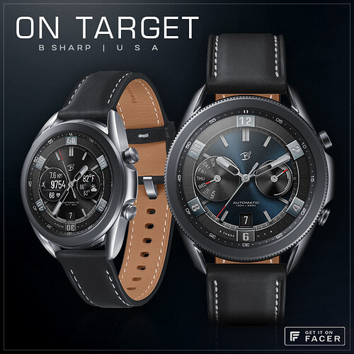
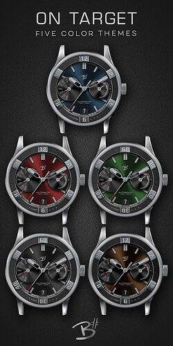
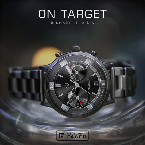
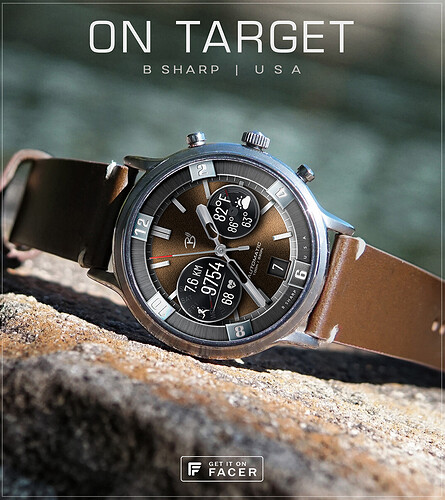
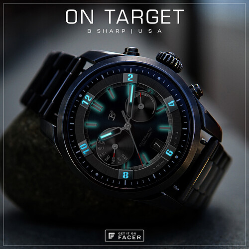
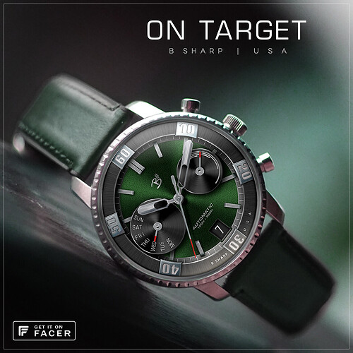
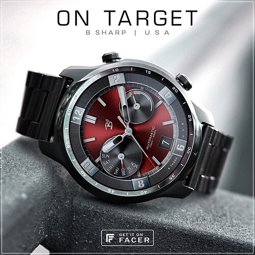
Here finally is the premium version of one that was first released as the free Red Dragon.
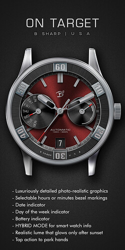
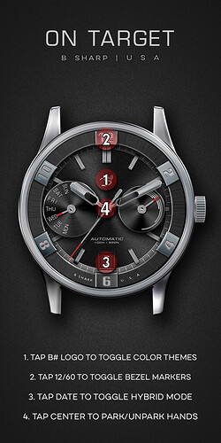
Now there are 5 color themes, selectable Hybrid Mode for activity tracking and weather info, and the outer bezel ring can now be selected with either hour or minute markings.
The idea behind this design was to create a bold diver style bezel but such that it was integrated into the layout more as a chapter ring.
There is a cool dynamic lighting to the base dial that is interactive with the movement of your wrist, and a realistic lume that glows after sunset in AOD. All in all I like how this one pops on the watch screen 
***** Check the pics below for more info and tap instructions!
Enjoy! And be sure to follow B Sharp to never miss a new release! And on instagram:https://www.instagram.com/bsharpwatches
Smart watch faces for watch lovers!
4 Likes
I have to stop looking at this quality of work, makes me want to quit altogether 
Those faces are amazing! How much time do you spend working on one of these marvels?
2 Likes
thank you @akar.zaephyr ! I guess it usually ends up being 5-10 hours, I don’t know, maybe more sometimes maybe less. I’ve been making faces for about 3/12 years so my workflow is much more efficient than it used to be. Also I’ve got over 100 original designs now so that means I can save a lot of time by using some elements of an earlier design in a new one. And I have a whole folder full of 2000x2000px texture “blanks” that I’ve made over the years. Various metals and guilloche patters and such. Then there are all the photoshop layer style presets I’ve created which save a ton of time even if I’m tweaking them with every layer, at least I have a one click starting point.
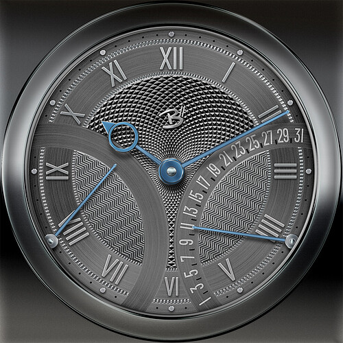
as an example… this is what I have been working on this afternoon. About 3-4hours into it so far.
A lot of that time is spent just staring at the screen 
But every texture is one from my library (all made from scratch, just not today) so that saves time, I only have to mess around with the lighting. And I got lucky that the date numbers and layout was the exact same spread as an earlier face I did called Miles Smiles. So I was able to just import those photoshop layers, position/rotate and change the font/sizing without having to do the math and lay it all out for however many degrees the arc is, or type in each number and rotate each one. So lots of past work saves time in the present!
Still a long way to go with this though… finish the power dial on the left and probably a few more details, then all the customizations, and then building it. So I expect another few hours for sure.
2 Likes
On Target sure is that kvansant, as always you’ve done a great job. Looking forward to seeing the finished Face that you’ve previewed for us lower down as well, its’ looking pretty neat so far with definite potential 
1 Like

