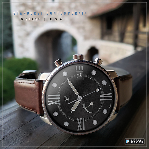
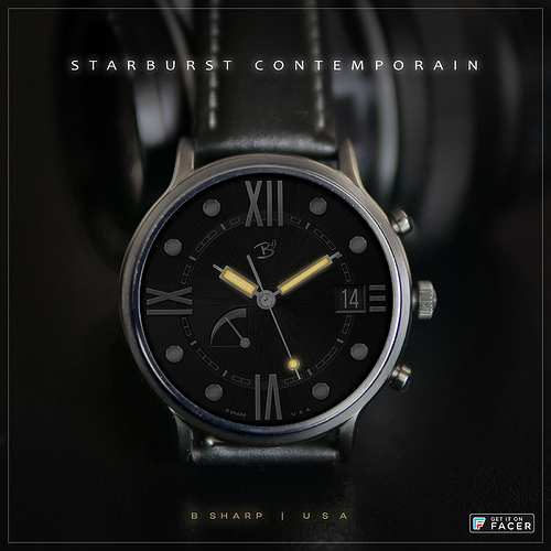
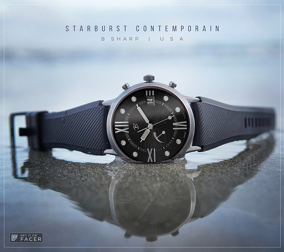
Now published. Here is an uncluttered dial reflecting a modern take on timepiece classicism with the essentials of time, date and power level, rendered with signature B# graphics and detailing. I decided to go with the black dial for this one, though I’ve made platinum and blue variations as well which will be included in the premium version (if there ever is one) along with Hybrid Mode for smart watch info.
I mentioned in an earlier preview that this face came about as I was working on a much more complicated multi-plane design. I accidently turned off a group of upper layers and saw the beginnings of this face hiding underneath.
I’ve included a subtle orange glowing lume for this one too.
Follow B Sharp here on Facer to never miss a new release! Also follow on Instagram for more snazzy pics and videos: https://www.instagram.com/bsharpwatches
Enjoy free face #99! 
4 Likes
Looks great mate. Thanks for the lume blur tip (really great idea) - just used idea this on a design with ‘flat-design’ (index printed / not applied) piece…
Cheers
Rich
Ps. Just wondering what a second power guage (RHS) would look like, mirroring the watch battery, for phone battery…
Thanks Rich! Yeah I usually do varying degrees of glow on the lume. Sometimes I like it better with sharp edges, really depends on the face I guess. The lume for this particular set of hands has a layer for the glow on top with very minimal blur, and another layer under each hand with a wider emitting glow. I don’t use lume as much on Facer as I do in Watchmaker because here you can’t turn them off, and I usually don’t like to see the lume during the day. But this one is limited to the hands and after wearing it for a couple of days I decided I didn’t mind it.
…wait weren’t you just asking me about stripping things down, and now you want an extra watch battery dial?  . It would probably look petty good that way actually but I was aiming for minimalism with this. Also that’s not info I find I care to have on my watch so it’s pretty low on the list of things I try to fit in. And… asymmetrical balance is usually more interesting to me than symmetry. There you have it.
Lol, I do find our banter as entertaining as it is informative. True, I do like balance, beit asymmetric or otherwise, but (TBH) asymetric would make graphic demands from the opposing index, n’est pas?
I’ve not received an email from the ‘gods’ this Thursday. So I guess I’m no longer featured… Oh well, back to fishing for clicks amongst the garbage of marvel comic screen grabs, pictures of nieces, uncompromisingly angled shots of women featuring their best ‘assets’, and animated insects.
Not sure what you mean about turning off layer in facer (lume), you can - but perhaps I misunderstood.
I don’t follow ?
What I mean is to set different dim modes. In Watchmaker I’ve always set my lumes with 3 user choices: ON, OFF, AUTO in auto the lume only comes on between sunset and sunrise. I imagine there’s a round about way to do this in Facer with VAR but I think it would be a bit convoluted and I don’t have Pro anyway. I’ve made a couple of faces here with 2 versions, one with lume one without. But that is not ideal so mostly I’m just staying away from lumes here.


 . It would probably look petty good that way actually but I was aiming for minimalism with this. Also that’s not info I find I care to have on my watch so it’s pretty low on the list of things I try to fit in. And… asymmetrical balance is usually more interesting to me than symmetry. There you have it.