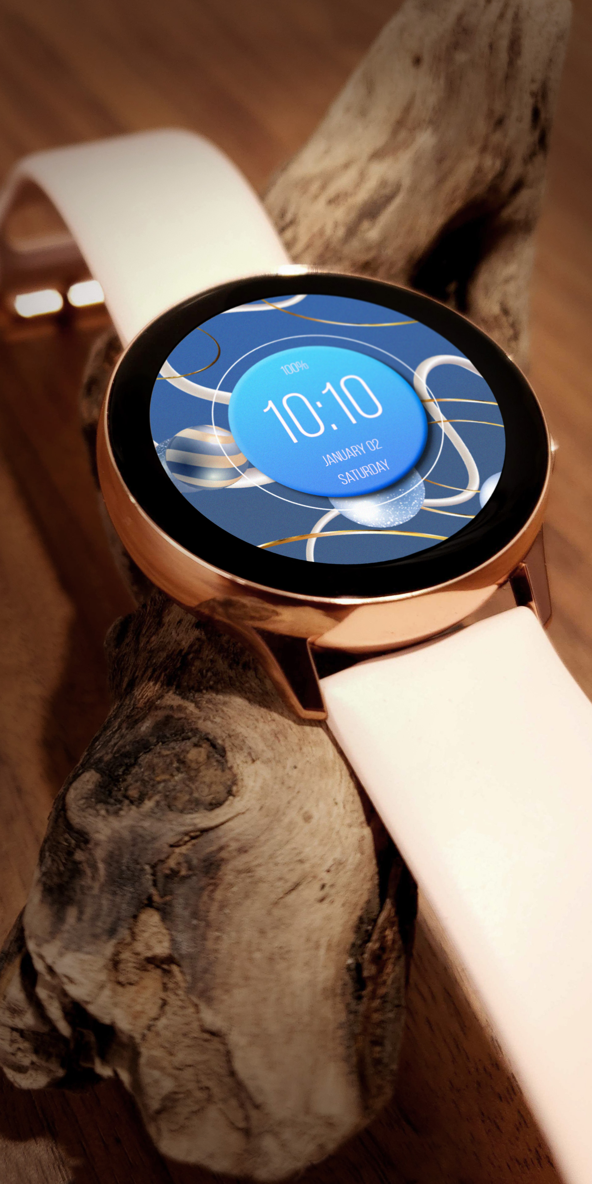
Realistic background with blue spheres animated. A good thing - repeat it 
4 Likes
I like the spheres, but think it will read better if the text did not change colour, or else not change so often.
2 Likes
I’m in agreement. As a general rule flashing text hinders readability for me, and I guess for me simply looks unpleasant too. But aside from that the design is a nice one!


but of course. So far the votes here are unanimous  I sometimes use a flashing heart icon next to the static readout of the heat rate. The heart pulses at the same rate as the reported heart rate. On one face i didn’t quite have room for the icon so I chose to just flash the heart rate number thinking that would make it more obvious what it was without a label… Naturally one of the comments I got was “don’t like the flashing heart rate”
1 Like
