“Station” series (up to this point one, that changes now!) has been joined by Fit Station, after Weather Station (that turned out to be #2 most popular of my faces!).
It’s still work in progress - while I’m 90% happy with the layout, I present you my work at this stage as I’m not sure if the data displayed is clear enough, or if UI surrounding step tracking / heart rate isn’t too hard to read. In the end, I’ve been staring at my own design long enough to understand what I want, but it’s the first glance of others that is usually the best indicator of whether I’ve succeeded or not.
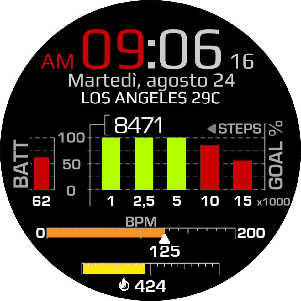
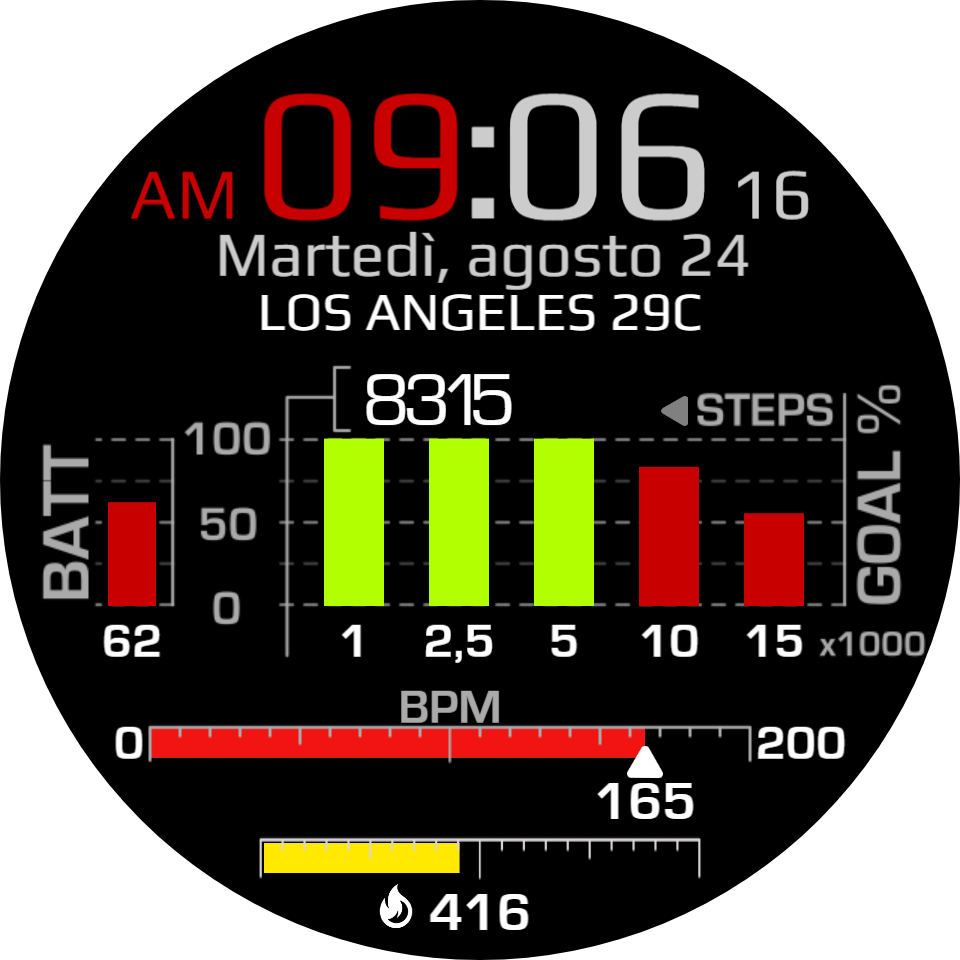
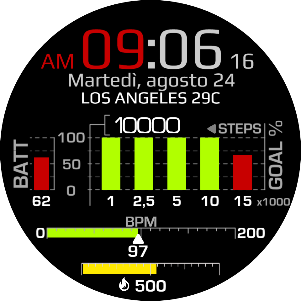
So here goes, AZ026 - Fit Station:
Please let me know how you feel and if there are areas that can be improved upon.
Thank you so much in advance! Greatest Community I’ve been a member of
First of all, take all this with a pinch of salt - it’s just my opinion :-). I don’t understand why you want five graphs for step goals. The layout is very impressive, I just don’t understand the point of it. I also think that putting the heart rate in a bar implies that the purpose is to reach the end. Of course we know that’s not the case, but it just highlights the design point behind your choice of display element. So, to me, I would do the heart rate in a vertical format, and put it where the battery indicator is. I’d move the calorie burn up, and put the battery indicator at the bottom, either as a digital/numerical display, or a horizontal bar like the calorie burn will be.
I don’t think it hurts for the step count to take up so much real estate, but I’d do it as a single thick horizontal line that goes to 15k with markers at 1, 2.5, etc… instead of individual bars for those goals.
I like the overall design concept.
I like the alert colors idea but for me, applied in the original layout. And probably keep KCAL all red. I just think it starts to get messy when there’s too many colors going on, kind of like mixing fonts.
i agree with you in many case but just my imo when you have medium 3 secs to looks at watch different colours help to focus your eyes on what you wanna see, mixed fonts is different case since you need time to find and more time to read beccause they are falcon eye style in alot of faces
In particular, I understand and share a lot your idea and your way of thinking and designing, with respect to information in everything in general …
But I also agree a little with @richiebee …
Regarding the steps, and the BPM information … Cordially my friend !!!
Wow, a lot of feedback, to which I apologize I respond only now - spare time got little sliced yesterday
Thank you! I’ve incorporated the calorie meter to the heart rate scale so they take up less space while still presenting information.
I’ve started testing color grading depending on progress of the bar and it worked nice for 1k goal, but for 2,5k steps it didn’t work as intended - I decided to focus on laying out everything first and once that completed, then I can mess about with color grading and see how it works together.
Thank you for your input!
Thank you for your feedback, Richie!
The idea here is to encourage user to keep chasing goal after goal. Yes, I can incorporate just one bar and have it display amount of steps up to 15k, but then the face is no different than thousands of others. With multiple step progress bars, the psychological effect of being half-way to another goal once you achieve previous one may encourage people to keep going. And different people need different goals, there’s that too.
Inspiration originally came from TicWatch heart rate monitoring app and its BPM tracking chart, I wanted to achieve similar feel…
… with the added difficulty of needing to also display time and other information
While I respectfully disagree that the BPM scale implies you need to reach the end, I can see that pairing it with calories burn - that actually does! - may have been unfortunate. I’ll go back to drawing board and separate the two elements but I would like to keep the heart rate away from the steps / battery section, and for a reason. That’s because these two elements share the same percentage scale, which is the idea behind putting them together
Do you mean the first version where BPM was a lone progress bar? I nee to figure out a way to keep track of changes and how to present it in a thread, because changes to the face overwrite previous ones and then it can’t be seen…
Agreed, I liked how colors gradually changed when I tested it, but I’m also aware it can start looking like Pollock’s canvas, and then you don’t have a leading theme color. Something I’ll need to test out and decide on.
Thank you, JD, gentleman as always!
What do you guys mean by that? Sounds like something worth knowing to avoid
Thank you all for commenting and sharing your honest thoughts! I know it’s not easy to feed back information, especially when you add criticism.
Back to work then…
I’ve worked a lot under the hood to somewhat change the layout a little bit for the square watches to better utilize their space. Additional work for metric/imperial was done as well. AOD now has PM moved from let to right in place of seconds.
Major changes done to color grading for progress bars as they near the goal - same has been done for battery. Let me know what you think - better with flat color of progressive color?
IMO the colors are nicer and allow to easily catch up on progress, plus it’s not as monotone, but on the other hand it feels like this distracts from date and weather… I’m on the fence here.
Oh, and there’s one small detail, something I should’ve done long ago - wonder if anyone will catch a totally new element not seen on my faces before
looks good! for my tastes I like that you kept the color scheme framed by the red accents. It looks a lot cleaner to me than if you introduced yellow to one of the lower progress meters.
And… logo! …though it could stand to be a little bigger.
Thank you so much for your opinion, it has been very helpful
Funny thing with that color gradient for heart rate. I planned trying it out just like with battery and steps, at the very least to see if I can do it and if it’s not making too much of a circus.
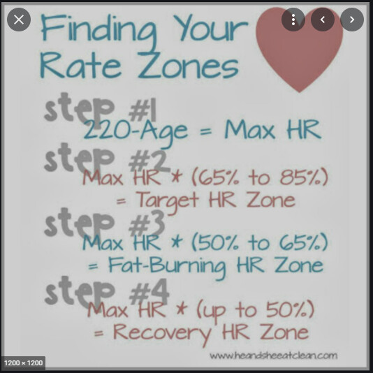
Quick research showed that there is a basic equation for max heart rate, (220 - age). This then gives the heart range, which in turn is divided into percentage ranges of what is a fat-burning range, what is a resting range etc., like below:
This means I can’t reliably mark any certain BPM as resting or other engagement levels, there’s no universal scale.
However, it is a good basis for an interactive watch that takes Var_1 (user’s age) as basis to adjust color scaling and heart rate ranges. That’s the actual reason behind leaving heart rate progress bar red but I certainly see your point now. Visual balance is what I would call it - definitely something I’ll remember
You’ve nailed it I’ve increased the logo slightly - I’ll make it more prominent when I’m better at making watch faces and have something akin to your level of finish in my portfolio I’m just an amateur at this stage so you know, vanity and all.
Thank you for your feedback!
Actually, thank you to Everyone who took their time to comment and criticize where you felt it’s necessary. It’s been a pleasure learning from your different perspectives and applying the knowledge to better the design!


 and have something akin to your level of finish in my portfolio