Hello!!! I am an Argentine designer. I present my new design …
Hope you like.
I am looking forward to continuing to grow !!!
I go for many followers … hahaha
7 Likes
Great.
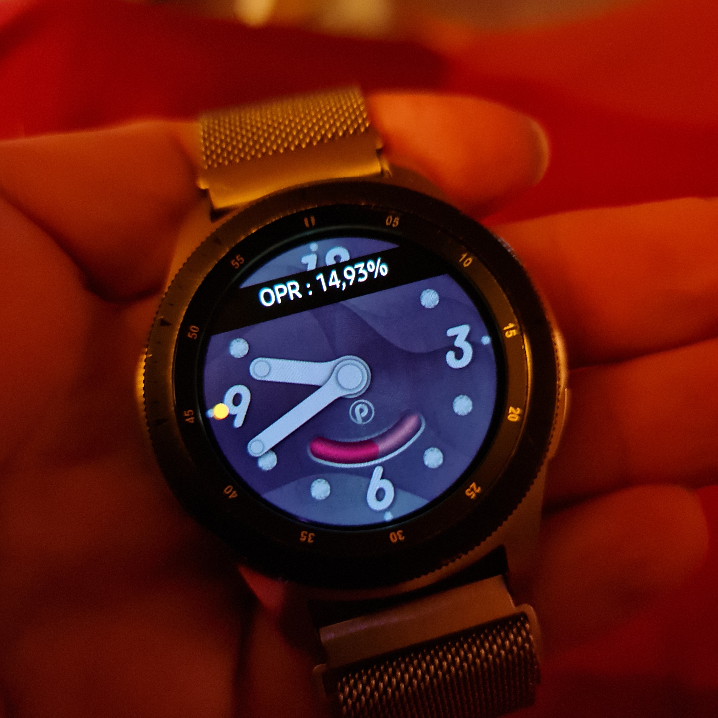
Brightness in AOD mode is slightly higher than recommended. It should optimally be below 10%.
Either make the background a little darker, or insert a square over the entire watchface, set the black color and transparency to be 50%.
1 Like
Simple, nice and quite original. I like it! 
1 Like
Very nice in its’ simplicity 
1 Like
Thank you for your observation!!! It helps me improve and grow !
1 Like
 Thanks!
Thanks!!!
1 Like
Hey @petr.patocka, on what basis do you make that comment? Is there a list of recommendations like this? I know everything on my watch looks dim in AOD mode, so I make the important things as bright as possible so that its actually usable. Where does this 10% come from, and how is it measured?
1 Like
Thank you!!! 
1 Like
My thoughts as well actually Rich 
And just for the record, I think it looks just fine in Dim Mode
1 Like
nice work Paula, I like that your style is already so identifiable 
also… as a bit of housekeeping I moved your thread here to the Design Showcase category. This is the place to share faces
2 Likes
It is based on the Samsung GWD recommendation. On the Samsung watch, turn on the developer tools then turn on the “On pixel ratio”. The result is in the picture. If I remember correctly, the recommendation was below 10%.
1 Like
Cool, thanks. I don’t have a Samsung watch, but it would seem logical to me that “on pixel ratio” would be related to the number of pixels that are on, not how bright they are - so you’d need to increase the number of black pixels to reduce the “on pixel ratio”. Would that be right? My understanding is that pixels need to be black (color #000000) to turn off on OLED watches.
The description suggests this, but it really expresses it and measures rather brightness.
1 Like
Thanks!!!
1 Like
Beautiful design, love it! If possible please add a date as well.
1 Like
Hi! Thank you so much!!! it’s a great idea. I’m going to do it. Thank you for your message♥️
2 Likes
I’m new to this and I think it looks great. Simple and easy for those who don’t want complicated watch faces. I’m starting out new. Designed 4 over the weekend. Can’t wait to publish them. One is going to have a black background. The other with a picture .
1 Like