…and finally the current (Mai 2018) contest is a perfect match in my opinion.
Ticwatch Metamorphosis
That do you think about this kind of design in general?
…and finally the current (Mai 2018) contest is a perfect match in my opinion.
That do you think about this kind of design in general?
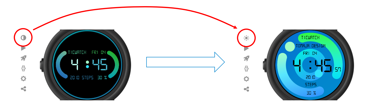
Love the wakeup animation, color changing background, etc… very innovative/creative!
Not quite as sold on the font choice to be honest… it lends itself to LCD designs, and I don’t know how it’d look on my watch (small thin text is a mixed bag – that or I’m just getting old :D)
Either way, nice work!
The opening effect is a real killer, but the face itself is rather average.
thanks for feedback. I will use your recommendations at the next watch face if you agree 
For sure.
We should help each other … and its important to tell the truth. It helps to get better.
BtW: the effect on the Tomaja Logo is really nicely made and funny but in this Case a little bit to much imhO.
Of course, anytime!
I like it, but I am a big fan of wake up animations. I’m not a huge fan of the mobvoi logo but I understand why it’s used in this application. I’d like to see you do a wake up animation like this of your own style or logo. Either way I enjoy this metamorphosis.