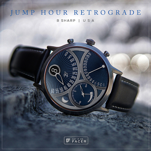
We’ll I’ll be danged, blue might look better than black! Every time I make a blue faces then later make a black edition I think the black looks even better, and if I make black first then later I think blue looks even better. I guess whichever has got the new car smell 
Normally my color variations also include a change of textures, but in this case the starburst lines emanating from the axis of the minutes and date indicators are arranged to assist with their respective reading so I didn’t replace that texture.
Enjoy! And be sure to follow B Sharp here on Facer to never miss a new release! …and on Instagram: https://www.instagram.com/bsharpwatches
