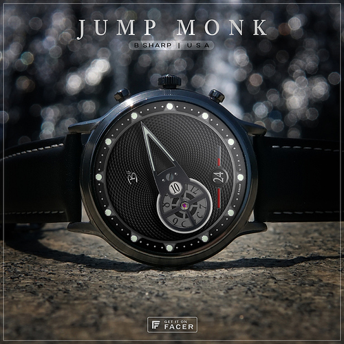
I came back to this wandering jump hours design to dress it up in black  Two previous versions (red and blue) have been published, but here’s a recap on what’s going on:
The watch features what’s referred to as wandering jump hours. The complication involves the hours wheel orbiting (wandering) around the center axis while simultaneously rotating on its own axis at the top of each our (jumping). This assembly is itself the conventionally sweeping minute hand. For all its novelty, reading time is still very intuitive. There is also a large date indicator and to further the theme, a battery indicator that “jumps” the date window. The bar to the right of the date shows progress from 100-50%, at 50% power the bar to the left of the date begins to indicate the remaining 50-0%. There is no gap in the progress bar as it “jumps” the date.
This version has a lume for dim mode, I’ve been foregoing lume on most designs lately, but lumes generally look best against a black theme so I decided to bring it back for this one.
Follow B Sharp here on Facer to never miss a new release! …and on Instagram: https://www.instagram.com/bsharpwatches
3 Likes
I really like this one, my OCD wants the current hour to be counter rotated in the window to stay vertical tho
I agree with that. I also wasn’t sure what info I’m seeing in the circle, so thought perhaps the hour could be in there, larger, and as you say remain vertical.
@ssjedwards and @dhemsley Thanks! I wouldn’t mind the hour being a little larger either  but the reason for it’s size is dictated by the mechanical confines. I know of course we can do whatever we want on a digital face and the rules are not constrained by mechanical limitations, but (attempted) mechanical realism is both a big part of the fun for me and a characteristic of the B Sharp brand I like to remain consistent with.
A jump hour indicator of course is a stationary wheel so the display remains upright, but in order for a wandering jump hour to remain upright each individual hour in that wheel would also have to be rotating on its own disc. This is conceivable to me on a larger scale, but I just don’t see it possible in this application. Simply making the font larger is also not possible, you can see the wheel itself is as big as possible in the available space. and when I made the wheel I scaled each number individually to be as big as possible in the opening. The opening itself and the relationship to the numbers is also as big as possible so as not to have the adjacent numbers bleed into view. Like I said, this is all to serve an artificial boundary but it what is the most fun for me because it feels a little more like actual watch making 
The pioneer of the Wandering Jump hour complication was a guy named Vincent Calabrese. I believe he always had his wandering hour orbiting more in the outer circumference of the dial, not in a central minute hand assembly like this, but still his hours did not remain upright for the same mechanical reasons I suppose. But his solution was to use the letters S and N in place of 6 and 9 to avoid possible confusion. My feeling was I simply like the look of the numbers better and I won’t usually have doubts about whether it is likely to be 6 or 9 o’clock range 
There’s another brilliant contemporary watchmaker named Ludovic Ballouard who has a watch called Upside Down, where each hour is indeed on its own disc always upside down until its turn to be upright. But the mechanics for that movement fill the entire case, I don’t see that happening on an already doubly rotating hour wheel 
Anyway, as you have probably noticed, I’m always happy to talk about these things. The decision making process is always very interesting to me.
2 Likes
Googled. He has some amazing mechanical designs!
ideed! what some of these independent makers are doing these days, mostly by hand, is really amazing. Even mind boggling to me when you consider the scale of it all. It’s easy to forget when zooming in on a 22" monitor to adjust some pixels here and there, that their whole arena is inside a 40mm circle!
 Two previous versions (red and blue) have been published, but here’s a recap on what’s going on: