Hi to all,
here’s another try with mandala’s background, this time a little different, trying to represent a crescent moon. I’ve tried to mantain an elegant and simple style, with few colours. This face will surely be part of a dedicated collection I’m trying to build 
Let me know what do you think about it!
3 Likes
this is really nice! Great balance and just the right amount of accent color. Something slightly bothering me about the clock dial though. I think maybe it’s because the mandala suggests a different center point. I like the idea of how the dial is creating the crescent moon out of the mandala, it’s just something a little off about how they overlap that looks a little haphazard, especially compared to the rest.
3 Likes
Very nice artwork on this King david sir, but I have to agree with kvansant above about the off putting centralisation of the Analogue Clock
2 Likes
So, @kvansant and @icrltd4, let me understand… you find a little bit strange the fact that the center of the hands is different from both the center of the clock and the center of the mandala (enlightened part). Is it right?
I’ve put the center of the hands on the shadowed part of the moon, because it seems to me more readable than being at the center of the mandala or of the whole clock, and also more equilibrated/relatively symmetrical (I don’t know how to explain it  ); it seems to me also that having the hands out of the crescent part of the moon should put attention the the moon that is not covered by anything and gives the effect that the moon is “embracing” the clock
What wuold you have done instead? I’m really interested in your impressions because I don’t have that sensation, and knowing your point of view could be a new lesson to learn for me
1 Like
It’s all good my friend, it works just fine as it is, it was simply unusual to see the analogue clock face uncentral within your manadala design. That is your design, and how you like to perceive it, so leave it, I’m sure it will be a hit amongst your many fans my friend 
1 Like
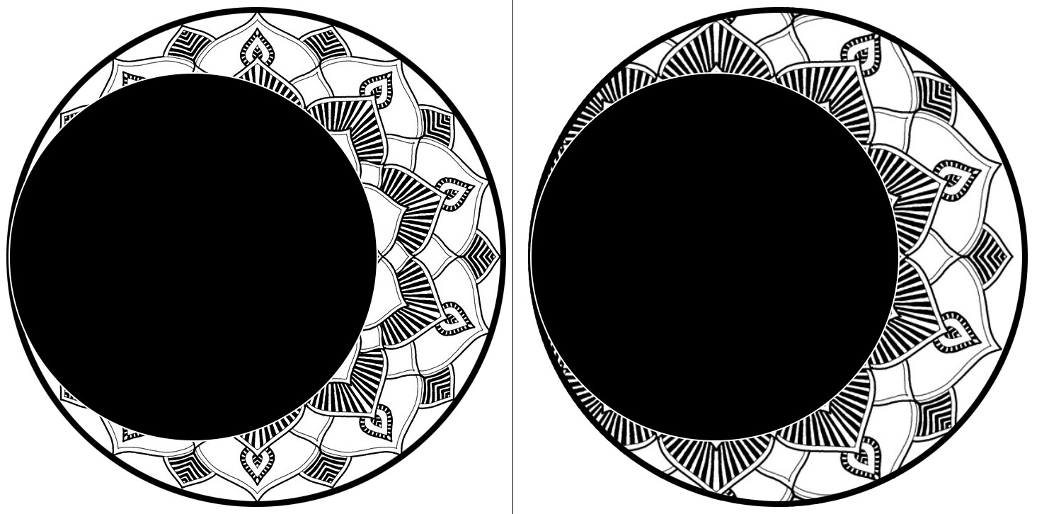
I think I did a poor job of explaining… here’s an example of what I’m trying to suggest. On the left is the alignment as you have it. The clock dial and the mandala don’t share the same center (is that called the focus?). on the right they are aligned so they share the same center. Make sense? To me this creates a much better visual balance. What do you think?
3 Likes
Hi @kvansant, sorry for the late answer… Well, your images gives a clear explanation, now I understand what you were saying, thank you. The center part of the mandala could be effectively better looking in this way. There’s only one thing I’m noticing, and I don’t know if inconsciously this thing was the reason of making me draw the crescent moon in this way: the mandala is not only in the moon itself, but its outer “rays” are beyond the moon body, even if with a certain degree of opacity, and that’s where the centering come from, it is the center of the whole mandala, but being its outer part less visible, the eye receives that strange effect you found.
Another thing is that, starting from the whole mandala I thought that the center should be the center of the moon, and when it is crescent, it’s for an Earth shadow on it (am I right? ) , so the crescent moon should have the same center of the full moon (without shadow)… probably that was my strange logic!
Anyway, your suggestion it is very good and interesting, and probably it is better to give reason to the eyes than to strange logics! I’ll see in which way the whole mandala should change and how it will look and I’ll see what to do. Surely if I’ll work on another design similar to this I’ll take in account your suggestion
Thank you very much!