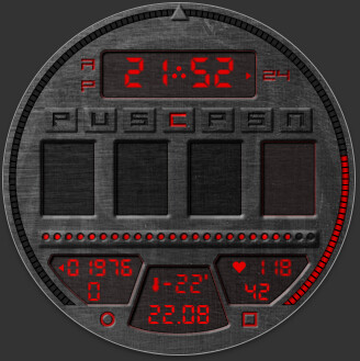
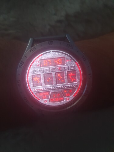
I found a couple of dials on this topic on Facer, so I would like to present you my version.
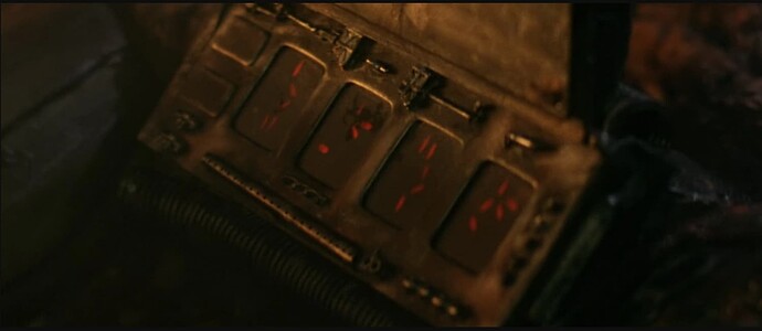
This is Fun Art inspired by the movie Predator, who didn’t experience childhood in the 90s doesn’t know. ![]()
Again, I will be happy to receive feedback for any criticism.
Cool. Looks nice, better than my versions … looks like I need to upgrade…
Here my little series - for inspiration…
btw. Here the predator font:
Thank you for the compliment, thank you. If you are interested in some files such as character count. I’ll be happy to provide them.
I tried to stick to the concept of a device on the hand of a predator and thus preserve the main elements that characterize it.
Yes, I went past it, but it’s a font somewhere for headlines or a banner, but not much for the dial.
Hey, I like this one, very nicely done indeed:+1: All the texts seem too small for me though, surprised they’re not Bold or a little larger ![]()
Bloody great design though, I’m impressed ![]()

I couldn’t afford a bolder or larger font, this is the maximum so that it doesn’t look like a punch in the eye. unfortunately, I won’t really do anything with it, only redo the complete dial.
I like the battery designators for battery gauges very much. So plain and simple, yet perfectly intuitive. Maybe I borrow that idea someday.
I do not want to argue, the dial looks good, but I think there is a bit room that allows to accommodate 24 or even 26 font size on the lower displays

Peto inspector is unlocked, you can try, but you definitely won’t get 26 there, and 24 will be very pushy. I think it’s 21 here.
On my screenshot above the 4 bottom texts are 26, and steps and heartrate 24.
I cheated a bit, removing the year digits ![]()
I also experimented with it by shortening the date by years and trying to put it in different displays.
Very interesting

