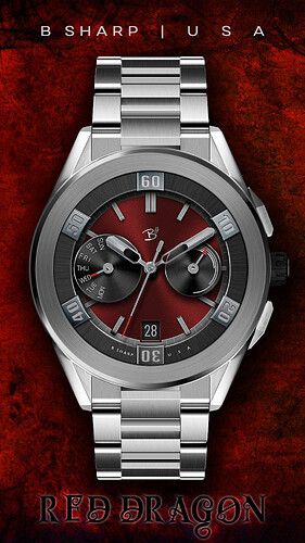
My schedule has been a little hectic lately and yesterday was the first time in a while where I had the chance to sit down and work on a design for most of the day. Here is the result  I really like the bold big bezels that are typically found on dive watches and some others, but there’s really not much place for that in a smart watch face as it uses up a lot of valuable real-estate and looks kind of funny surrounded by the watch’s actual bezel. But I really felt like making one, just for the photoshop fun of it. So I tried to make it feel like a bezel but also like an interior element so not to be too awkward on the smart watch. I’m happy with how it looks, I hope you are too! And it’s FREE. Though I’ll definitely develop a full featured premium version of this design.
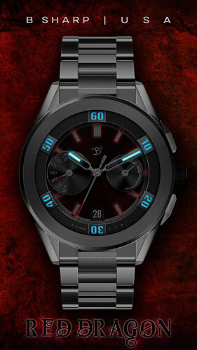
…also this one uses some dynamic lighting which I don’t think I’ve used on a face for about a year  I know some of you like that effect.
Enjoy! And be sure to follow B Sharp to never miss a new release! And on instagram:https://www.instagram.com/bsharpwatches
Smart watch faces for watch lovers!
5 Likes
Beautiful and good as always!
2 Likes
That’s brilliant, I love it, and the Bezel definitely does work 
1 Like
I’ve updated this face today to now include a dragon. It should have been there the whole time, but I originally left it out because it felt out of character for B Sharp. But as I was working on the premium version today, (which won’t be called Red Dragon because it will have different colors) I decided Red Dragon of course should have a dragon. 

1 Like
@kingDavid Yes Sir, “the cherry on the cake” is a well known phrase, meaning just what you think it does, but we usually say “the icing on the cake” nowadays, for some reason or other (maybe because we can’t identify as cherries nowadays 
 )
)
2 Likes
Really nice. And quality crafted as always. I would just have one question and one suggestion 
For some reason I cant get used to see the sub-dials of different size and still wonder what could have been the motive behind it.
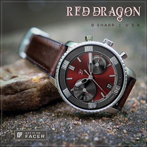
The “virtual” bezel looks better on watches with thin physical bezel, like Fossil Marshal, or on the last image.
1 Like
Precoius… as always… fantastic job dude!
2 Likes
thanks @petruuccios re: the sub dials, mostly simply for variety  but, there’s also a specific aesthetic judgement happening at the time I’m laying these out. I’ve used the expression before “balance of visual weight”, which may just be a fancy way of saying “eye-ball it”, but nonetheless, that’s how I work. Sometimes I want more of a symmetrical balance, sometimes not. It’s just a case of leaning back from the PC screen and staring at it for a while to see what feels right
And you’re right about the bezel. It’s always going to be slightly odd on a smartwatch. I just felt like doing it for the fun of the graphics. But I tried to make it a little bit like a chapter ring too, not 100% bezel so it would hopefully work better. The premium version has a tap to change the minute numbers to hours. I can tell you it looks fantastic on the H1, but I expect the black ring of Fossil watches would spoil it.
 I really like the bold big bezels that are typically found on dive watches and some others, but there’s really not much place for that in a smart watch face as it uses up a lot of valuable real-estate and looks kind of funny surrounded by the watch’s actual bezel. But I really felt like making one, just for the photoshop fun of it. So I tried to make it feel like a bezel but also like an interior element so not to be too awkward on the smart watch. I’m happy with how it looks, I hope you are too! And it’s FREE. Though I’ll definitely develop a full featured premium version of this design.
 I know some of you like that effect.


 but I don’t know if it is understandable

 )
)