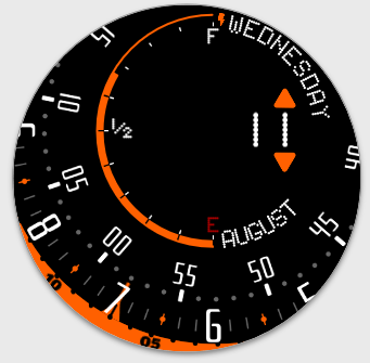
I’m getting less and less time to work on faces as my unborn child is nearing the big day, so I guess everything will slow down now. I’ve been working on this for a couple of days, bit on and bit off, as time allowed, and here’s what I came up with this time around:
Tell me what you think, it’s not released yet as I can’t decide whether I should keep or loose the tiny seconds needle. What’s your opinion? Anything else you think can be done better or clearer?
Thank you for you opinion in advance 
4 Likes
first… Congratulations! second, I like this design a lot but I also think it’s probably a bit tricky to read on the watch. I’m sure you’ve tested it though. But that minutes font is not an easy at-a-glance read. Especially since it’s not a conventional way to read it, you have to be able to actually read those numbers rather than simply go by position. Also I can’t tell at all what the text between 12 and 1 says. Even in the large preview on my PC . Aside from choosing a font which is more legible in smaller sizes, maybe it the 60 was also color accented it would help a little for feeling the relative position of the minutes?
But I really like the concept and the layout, and the balance of space and color accents. It looks clean, it’s just that it’s hard to read. Oh, and I’d keep the seconds hand. It’s subtle but adds a nice touch of motion.
2 Likes
Thank you, Boss!
The small font between 12 and 1 is just AZ024 (watch face number), guess I went a bit too far - 10 is too small for this one.
I’ll take all you’ve said into consideration, go back to drawing board and correct the weak points 
I’ll also remember to keep in mind easy-to-read font for unorthodox faces, great feedback! Thank you a lot 
1 Like
Thank you, JD! Appreciate the feedback and kind words!
It’s difficult to sometimes notice that some things are off, when you’ve been working on the face for hours on end. Fresh set of eyes is really what comes as salvation in these circumstances so the more I value both your feedbacks 
If only the kindest, most active people here wouldn’t be dotted all over the world, I would invite you all for a beer and a friendly chat 
1 Like
With all the pleasure, I too would have a couple of beers !!! 


And share things from the lives of each one of us …
It would be very cool …
And also, with everyone in this group
On my side … I too on August 16 my son Лев turns 10 … which translates Leo
We are going to have a busy week with birthdays !!!
Cordially
I like the overall look, and how you’ve done the Battery and Date, but I’ve no idea what the time actually is looking at it: I see the Hour and Seconds, but no idea on what the Minutes are sorry
1 Like
Thank you, I’ll take this into account when redesigning elements so that minutes are more clearly marked =)
2 Likes
Work is in progress but I thought I’ll try and address my design’s woes a little bit differently.
While the hour marker hasn’t been touched yet, what do you think of this altered, truly rotary way of presenting time now? Would readability increase now that elements have also increased?
Outer ring shows hour time progress, inner ring shows minute progress relative to the outer marker position that points at both hour and minute.
At this stage, no seconds hand as the zoom means half the time it wouldn’t be visible…
Is it better, or would minute dial require change of font still?
2 Likes
Do you plan to put anything in the unused central area? Maybe seconds could “roll” there.
2 Likes
For me …
The design change was a great success … !!!
The face of the clock looks more interesting …
(I also share the idea of @petruuccios  )
)
But for me … how is the design now …
It is very interesting !!! Very nice 


Cordially…
I think, also, it would be good, to give it a good publicity … so that people have an idea of how it works, the new design of the watch face … 
In itself … how is the design of the watch face, everything is very well understood
I like it a lot …like this 

1 Like
I think the second Rotary Two is brilliant! Having it this way makes it a LOT more readable, and not just because of the increase in size, also because the focus changed.
Although I’m a 24h kinda guy, for this one you could put AM/PM in the middle maybe? I wouldn’t clutter it up too much.
(Or make an actual 24h version. I made the following for myself once, with the hour ring being 4 quarters of each 2 layers and some opacity magic)
3 Likes
I’m on the fence here. Not that I don’t like the idea of seconds being there, I think it’s worth consideration. At the same time I like how the empty middle reminds me of Mazda’s Wankel crankshaft. If I can, I would like to incorporate seconds in analog fashion, like with the first one, but the focused movement is way too cool to pass… Still thinking about it but thank you for the feedback 
@cardozo198013 - Thank you for your feedback as well  Appreciate the good spirit word you give, even when you have a different opinion on something. Need to buy you a beer one day
@ThaMattie - Many thanks for taking the time to give your opinion!
Yes, the AM/PM and watch face logo are on the way. I want to try and incorporate them in a way that adds to the mechanical feel of a rotary engine and its elements at work. I’ll see if it’s big enough to be readable.
You got me there, the way the first 12h change for the second 12h is subtle, but so awesome when you realize what happened… very satisfying  Clever way to display 24h time using 12h motion.
Thank you tenfold for your feedback!
2 Likes
This is great! It both preserves the original character and takes it in a different direction. Totally more legible. I don’t agree with the idea of filling the center. The balance is perfect as it is. Super design!
1 Like
Ok, maybe no need to fill the centre, maybe there could be another ring running around in the pointer

A lot of the work done was under the hood - I’ve originally used uncompressed images so 1,5MB per image (with something like 30 of them) was OK to experiment, but a final version needed to lose some weight so that’s completed.
During experimentation I’ve branched off with this slight change to seconds display:
The seconds shield is obscured in half so that only current 30s is visible. Then, as seconds progress past 30, it rotates 180 degrees do show second half of the minute, and the seconds needle starts its 180 degrees journey again.
Unfortunately, this design has a flaw with seconds digits orientation - the whole disc is rotated -90 degrees from current plain set by hours indicator, thus half of it is upside down at hour 3 and 9 and I didn’t feel like creating four different versions of seconds disc - this solution would be cool for a face that stays in the same orientation so I’ve saved it for later.
This brings us to the final Rotary Two release 
After trying out different versions I’ve settled for a rotating seconds disc as it brought movement to the face and made it more lively at a first glance.
Now only two disc versions were required: one when time is after 9 and before 3, when fonts are up, and second for between 3 and 9 when they’re upside down (so they’re actually up in the bottom half of the face).
Feedback is as always welcome!
2 Likes
While still cool, I must say I preferred the one without the seconds. This feels cluttered/cramped in. Maybe if the center was a bit smaller so there can be some space in between de minutes and seconds… I dunno. Anyway, still a nice watch face, so kudos to you!
Thank you, @ThaMattie 
I like it the way it is now - I feel if I distanced seconds from other elements it wouldn’t look like rotary engine schematic (hmmm… changing colors could make it look like a schematic, I gotta try this out!).
But what you say is valuable so I’ll remember your feedback for my future designs so that I can incorporate these rules early in, when changes are still easy.
That said, thank you for being honest, it’s not always easy so the more I appreciate your feedback =)
You Guys are awesome!
1 Like
I believe B is better, as it’s easier to read the Time. Reading the Time is THE main function of Watch, and I believe it should be clear and easy to do so, so although you’ve done a good job on these Faces, I’m sorry to say that I could never like them (it’s just my opinion remember, your designs are all about what you like).
No worries there, I understand if my taste is different than yours, it’s only natural 
Happy we can share thoughts and opinions despite differences in them!
1 Like


