This one I’ve made a bit yesterday, and a bit during breaks at work today when nothing was breaking. Reused a piece from previous watch face because why do it all from scratch
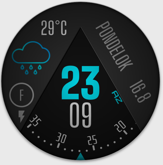
Is the seconds disc readable enough, or should I rather go back to graphical software and redo it using different font? All feedback is welcome =) and I still haven’t publish it in case some rework is needed
I am always surprised how bright stuff is on my watch when I sync it. Especially at night. As MAG says I look at seconds to check the watch has not crashed : )
@akar.zaephyr … Мне очень нравится твой стиль идей, а также твой стиль программирования …
Очень классная работа Я поздравляю вас !!! Очень хорошие погодные снимки! и секунды !!! Сердечно
Same here, that’s why all my faces take advantage of the OLED’s blackhole black
That and the fact that the LCD display in my Ticwatch can be seen on light backgrounds which makes the screen look like it’s smeared with fat… What watch do you use by the way?
Спасибо! That’s as far as I can pretend to speak Russian, haha! Thank you for your kind words, friend
The only thing I can see different is the degree sign ° - if so, that’s added. It is more self-explanatory now and the text itself seems to be filling space better as an added bonus. Did I get it right?
Pardon me, it was successful, I just have my monitor in night mode so dark grays and blacks look all identical You are right though, this brings some detail that was originally missing so I’ve added the lighter edge I wanted to leave the wedge black so the shadow wouldn’t even be visible and I’ve skipped it but thank you for the lesson, I’ll remember to try and add some small details like this to increase the quality!