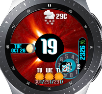
CME Event
I thought a Coronal Mass Ejection event would make a nice watch face, so here it is. It’s clean, yet modern and informative. The hour in a big bold font in the middle. The minutes are displayed within a circle at the traditional analogue clock location. The minute circle orbits the hour circle once per hour. The seconds are displayed in a wheel at the end of an electrical arc emitting out of from behind the hour, at the traditional seconds location of an analogue clock.
Date is in a window to the left, with moon phase. Steps are in a window to the right.
Current weather condition, day/night aware, is at the top. 3 Day weather forecast condition with daily high/low temperatures is at the bottom.
Battery level meter is at the bottom below the weather. Red below 30%. Green above 60%. Yellow in between.
12 hour and 24 hour mode compatible.
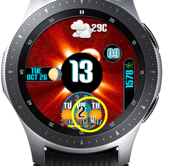
Cartoon
I was asked to do a cartoon themed watch face.
-Watch battery level meter is on the bottom. Green if level is above 60%. Yellow if level is between 30 and 60%. Red if level is below 30%. Colour coded digital readout.
-Steps meter is on the top right. Red if amount walked is less than 3000 steps. Green if amount walked is over 6000 steps. Yellow in the middle. Progress from left to right. Colour coded digital readout to nearest 0.1k steps.
-Daily weather forecast condition icons are left side of the screen, along with the weather station location. Daily high/low temperatures are graphed below the forecast icons, to show the temperature trends.
-Current moon phase is on the bottom.
-Date is above theweather graph.
-OLED, AOD mode, 12 hour mode, 24 hour mode compatible.


 )
) :
: