I would like to present two faces I’ve been working on for the last quite a few days (in-between actual work and room renovation…).
First, AZ017 - Hex Matrix, is an experiment with creating elements based on object matrix. I’ve tried hexagons during my first attempts, but I would like to try square matrix next.
Because it was more of a case study, it’s actually quite simple with barely “two” elements (at least on the surface cause under the hood it’s anything but simple).
Let me know your thoughts, I hope using this many images doesn’t impact watch performance negatively.
I can’t think of any other way of activating pixels (or hexes, or squares) so they behave in a 0/1 way when something below them shines, but I have an idea I would like to try.
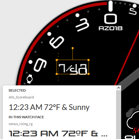
AZ018 - Minimalismo Four X, on the other hand, is throwback to one of my early faces that is one of the most popular, despite looking like I really barely started (AZ002 - Magnifico Toxica). I’ve decided to go with minimalistic style, but the main feature is the the split between right side, serving as minutes and seconds background for their respective hands, and the left side being 24h hand playground.
Battery level, date and weather also follow the minimalistic rule.
(I’ve initially created a little more elements, including percentage text for each battery, but it seemed too cluttered for me and this time around, I’ve decided to sacrifice exact readout for the sake of simplicity and uncluttered space).
As always, your unconditional praise is appreciated
Kidding, constructive criticism is even more welcome, you can’t learn if you don’t make mistakes, and the only ones not making mistakes are the ones doing nothing at all. So go at it, spare me not
I really like the 2nd one! I agree with your choice of no additional text. The battery bar meters provide the info and contribute to the balance and a nice accent color. Did you make your weather icons? Those look great too!
I think I’d prefer the date and weather to stay in one place, but that’s just me. I think you have them moving so not to be blocked by the hands which I can’t say is a bad choice
The first is good, just for some reason I like better the simpler matrix on dim mode.
The second one is really nice, maybe you could also try variation, where the hour hand would turn clockwise too.
Hello !!! @akar.zaephyr
The second design is new to me, very interesting the way to show the hours and minutes in sets. Very original work.
With the theme of the numbers of the hours and minutes, in my place, I would rotate them horizontally … to have a faster vision and information of the time, since the design is something new for people
The first design, for me it is very interesting, to know how you programmed it … good design creation !!! Cordially!JDCardozo
Thank you, Mattie! I’m not entirely happy with all the digits in the first one, needs a bit more of work for 5 and 2, they’re too much like S, I believe. So far nobody said a thing
And yes, I also thought of creating it as a font (which has the additional benefit of ability to be shared with Community ) but that’s an area I have no experience in yet. Birdfont is the only program I’m somewhat familiar with. I’ve tried coming up with my own 7-segment digit matrix but I need to sit down on it and research import option, since lion share of work was done in Inkscape already. Good idea though, it would definitely speed up future work should the font be reused.
Appreciate your words!
Thank you! I’m thinking of adding few more tiny lines to the hour marks to have the dual purpose of marking 3/4, 1/2 and 1/4 marks. I’ll see what time allows me to introduce
Yes, I’ve created them using Inkscape. Thinking of releasing them to the Community, would just need to clean up the original file so that people can amend colors easily to fit their color scheme.
That’s precisely why You’ve seen through me, haha I agree with you, though - I prefer for such elements to have a dedicated space. If time allows, I think custom hands should do the trick as those available in Facer didn’t fully fit what I wanted. Hopefully I can find an hour today to do it. Thank you for your feedback, appreciate it, Sir!
You’ve no idea how many times I find the dim mode to be more to my liking than the full face Maybe I should start taking a hint and working towards recreating that dim simplicity in the main face…
Interesting idea, I could try it =)
Originally, the counter-clockwise move of the hour hand is the result of me wanting for zero to be shared among hours, minutes and seconds hands. For the hour hand to be moving clockwise, I would need to redesign the left hand part. Not that I don’t want to do this, but if it’s required, then I think starting a new face that incorporates this from the start would be easier, and I’m already thinking of new features for such a face Definitely idea I want to explore so stay tuned
Thank you for your feedback!
Thank you, appreciate the good word Interesting point, I’ll give it a shot and see hot it looks. I’ll keep this in mind for the future, that a new way of reading time may require a bit of lee way. Invaluable! Thank you
Basically, I’ve used Inkscape and created simple, tiny hexagon. Then duplicated it and aligned the duplicate with the first one to leave some space between them. Then duplicated both, aligned them again and kept going until I had a full hex background (you can see it in the face as the background to active cells).
When that was done, I’ve just created a new layer for each digit, copied the whole matrix into it and removed what’s not needed, playing around with shape of each digit by removing (or leaving) hex by hex until I was somewhat satisfied.
Last step was to export each element as separate image (one for background, one for each digit and one for “:”) and align them in the face.
Thank you, Everyone, for taking the time to share your thoughts! Many different points of view really bring a new perspective to me and it’s good to learn from such experience! Kudos
I’ve updated Minimalismo with simple, custom hands, semi-transparent except for the tip - doesn’t occlude weather and date now so they can stay in one place
Nice, now it looks more like it should. Maybe check the date once more. To me it seems like you left there some unfinished font experiment in imperial date field.


 ) but that’s an area I have no experience in yet. Birdfont is the only program I’m somewhat familiar with. I’ve tried coming up with my own 7-segment digit matrix but I need to sit down on it and research import option, since lion share of work was done in Inkscape already. Good idea though, it would definitely speed up future work should the font be reused.