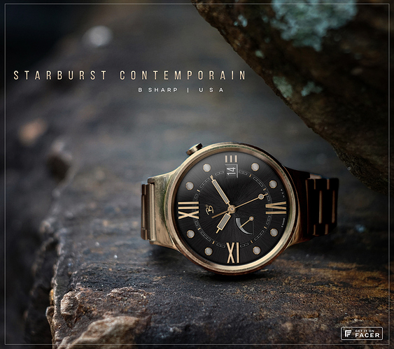
We discussed gold a bit yesterday in the Slack channel. Every now and then I revisit yellow gold to see if I can do something I’m satisfied with. Usually I think yellow gold looks too fake in watch faces (my own efforts included). There is a lot of complexity to the tones and shading, I think it’s because what you see on the reflected surface is so dependent of the ever changing environment and conditions influencing light and reflections. We think of gold as a… well, gold color. But you can’t just tint your object gold. There’s really a rainbow of hues and tones. And if you look at a picture of a gold object there are also places completely white and places completely black. Anyway, I keep trying and maybe I’m getting closer. This seemed like a good face to experiment with. So here’s some B Sharp Bling.
3 Likes
Great. In the Slack I saw the texture of the black background, it’s hardly noticeable here, but maybe it will be visible on the watch.
it’s more visible in larger pics for sure. But it does show up a little better on the watch too. But the texture is in this case a little bit subservient to the black background for the purposes of how this is intended to look. The texture is more of the star in the slate and blue editions.
1 Like
I like it. The “metal” ones you made so far looked really good at high res, but on a watch they could look a bit de-saturated, this makes it pop
Nicely done. Sometimes, less really is more… R
